When you’re planning to transform a small room into a spacious living space, you usually think in terms of a major extension. And yet, a simple coat of paint can be enough to give your interior a whole new dimension. It’s undeniable that the colors you choose have an unsuspected power over your perception of space. By choosing the right hues, you can create the illusion of a larger, brighter room, without breaking a single wall. Discover 7 colors that visually expand your space and 7 that stifle it, saving you from making mistakes.
When you're planning to transform a small room into a spacious living space, you usually think in terms of a major extension. And yet, a simple coat of paint can be enough to give your interior a whole new dimension. It's undeniable that the colors you choose have an unsuspected power over your perception of space. By choosing the right hues, you can create the illusion of a larger, brighter room, without breaking a single wall. Discover 7 colors that visually expand your space and 7 that stifle it, saving you from making mistakes.
1. Timeless white
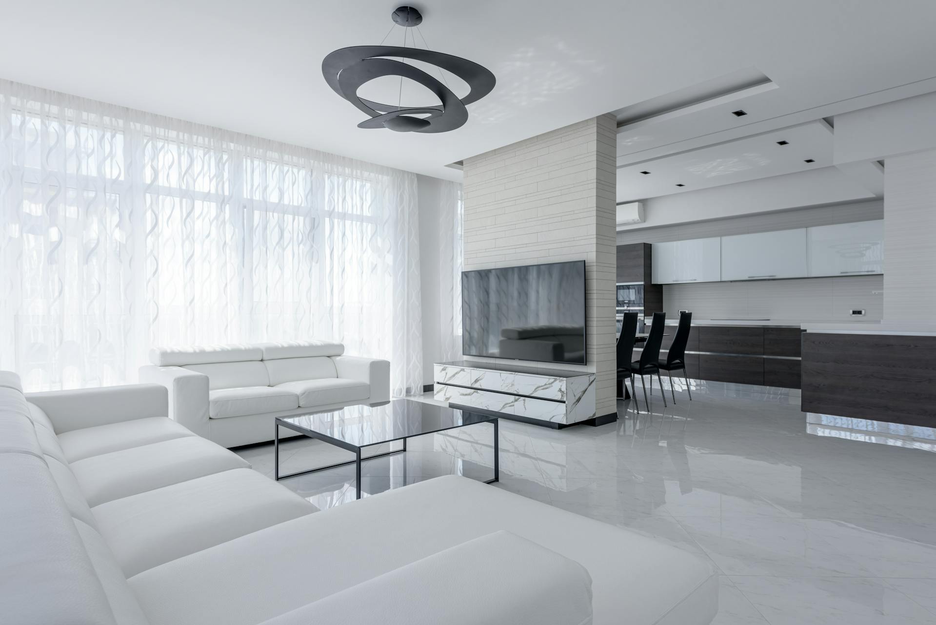
A cramped bedroom, a small living room, a hallway that's too long... When your space is too small, you don't really feel at ease. Timeless and classic, traditional white remains the most effective hue for enlarging your room. It adds luminosity and gives an immediate feeling of space. But if you find this color too cold, you can always opt for off-white or creamy white. Perfect for corridors, studios and small living rooms.
2. Soothing light blue
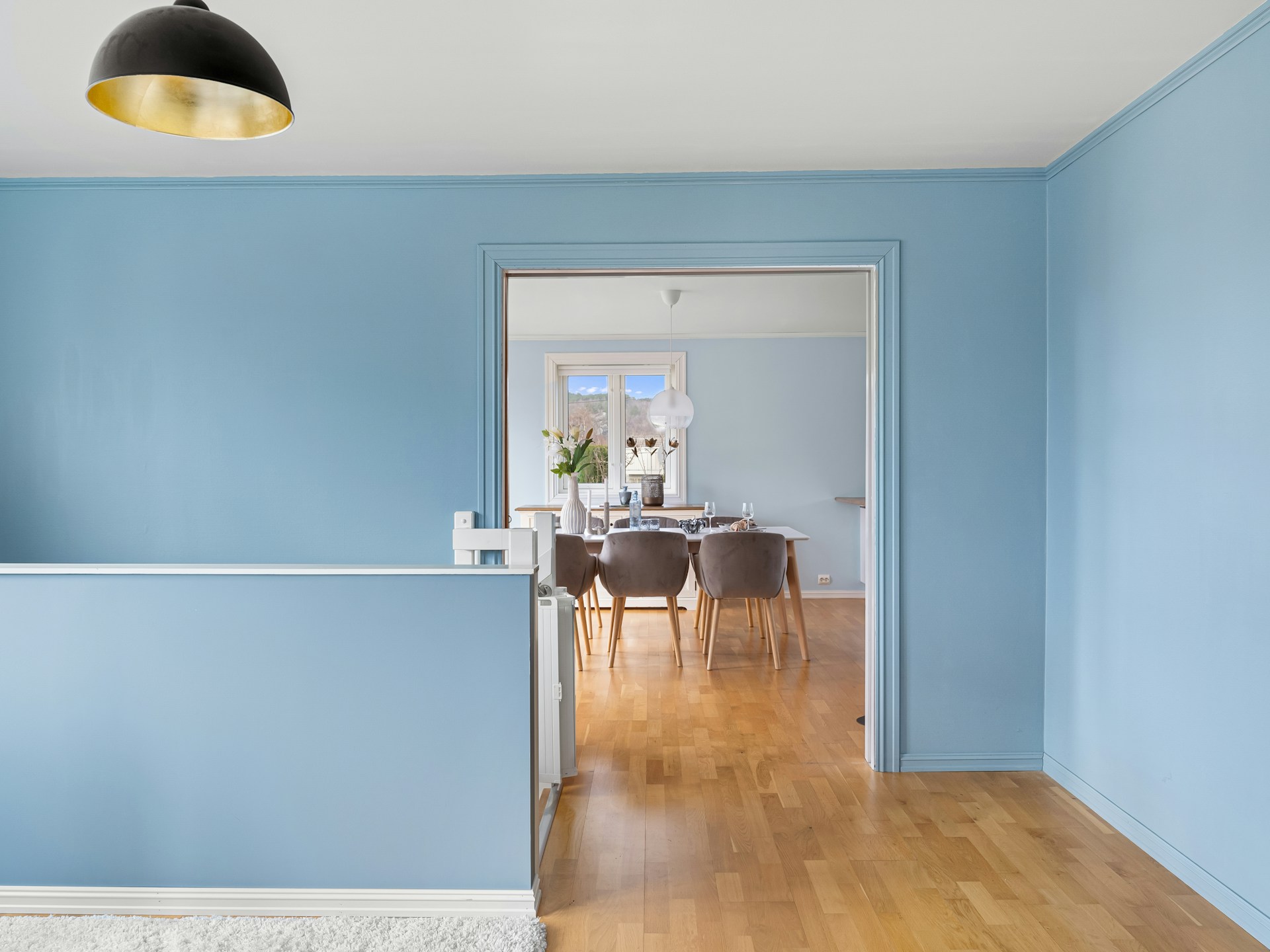
Light blue gives an impression of distance, like a horizon. This soothing hue visually enlarges a bedroom or bathroom. Don't hesitate to combine this color with white or light woods to add personality and character to your room.
3. Beige and sandy tones for warmth
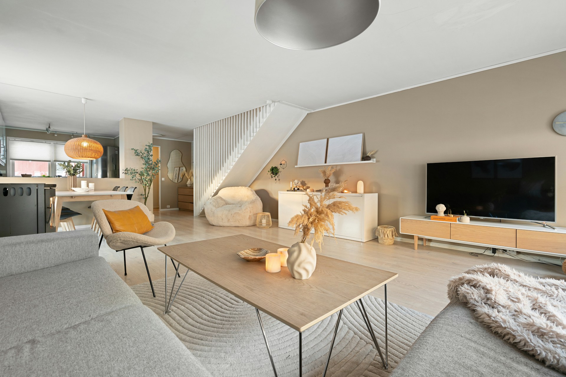
Natural shades such as sand, linen and beige expand your space without feeling "clinical". They're the ideal choice if you want to create a warm, soft and soothing atmosphere while retaining excellent luminosity. Their muted nature adds elegance and harmonizes with your overall interior design.
4. Pastel yellow: bright and cheerful
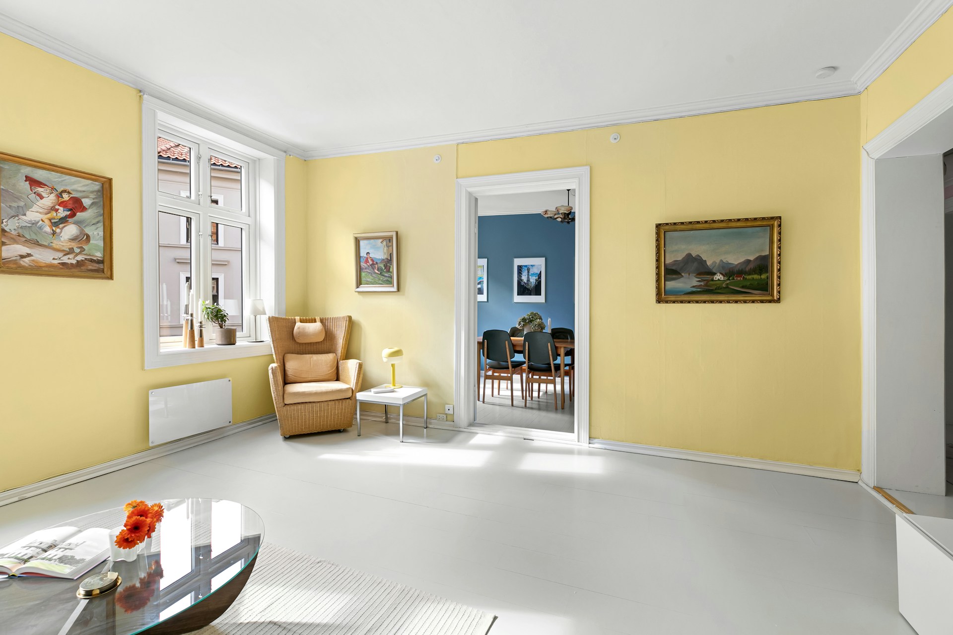
This unique shade captures natural light and radiates it throughout the room. Without being overpowering, it gives you a feeling of space and vitality. Associated with communication and cheerfulness, pastel yellow creates a friendly atmosphere and stimulates energy in your interior. It is especially recommended for narrow spaces with little exposure.
5. Light grey for a contemporary alternative
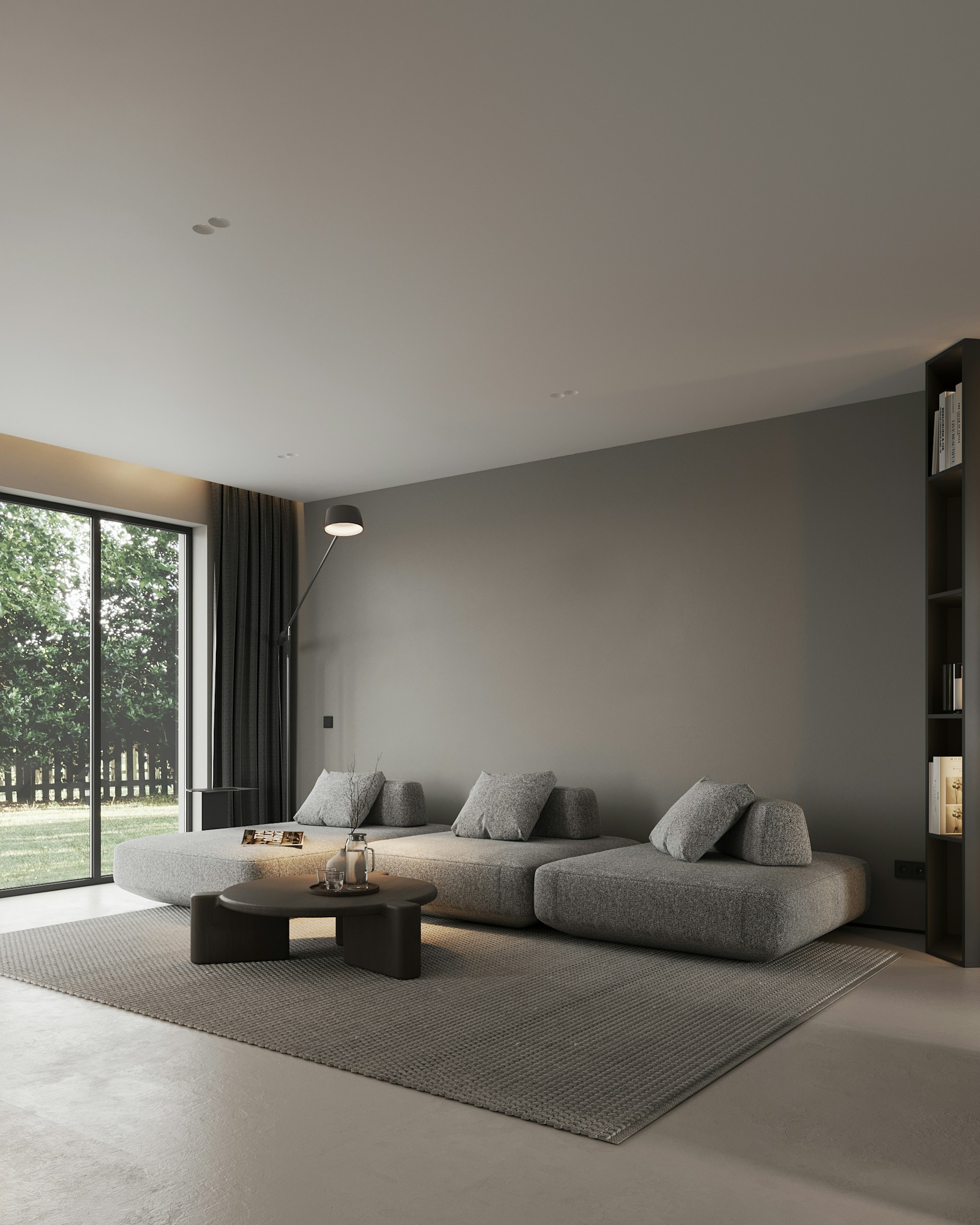
Much less radical than white, light grey is a modern alternative that enlarges your room without drawing too much attention. You can combine it perfectly with colored accents or natural materials for added dynamism. We recommend choosing "warm" shades, with a hint of taupe or beige, which act as perfect backdrops.
6. Powder pink: between volume and softness
Luminous and light at the same time, this shade gives you a feeling of openness while adding a touch of warmth. Contrary to popular belief, powder pink is very easy to integrate, even in a contemporary room. It's the ideal option for a soft cocoon without being namby-pamby. Combine it with brass or gold tones for a very chic touch.
7. Sage or water green: nature in the spotlight
Soft and ultra-trendy, these shades of light green add a natural, breathable touch to your interior. They're not just synonymous with enlargement, but also with serenity, transforming a simple room into a veritable cocoon. Providing an invigorating, fresh environment, these shades are excellent for kitchens or living spaces with a view of the outdoors.
8. Black, too austere
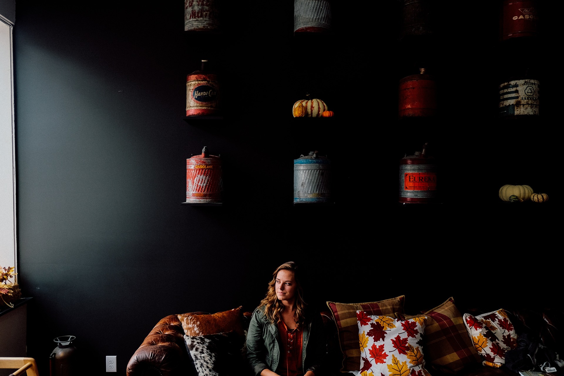
Although very elegant, black absorbs natural light and creates a sense of closeness and depth in your space. Moreover, excessive use can make your interior feel stuffy and dark. being perceived as a cold, harsh hue, black lends an austere, unwelcoming atmosphere to any room.
9. Dark red, too aggressive
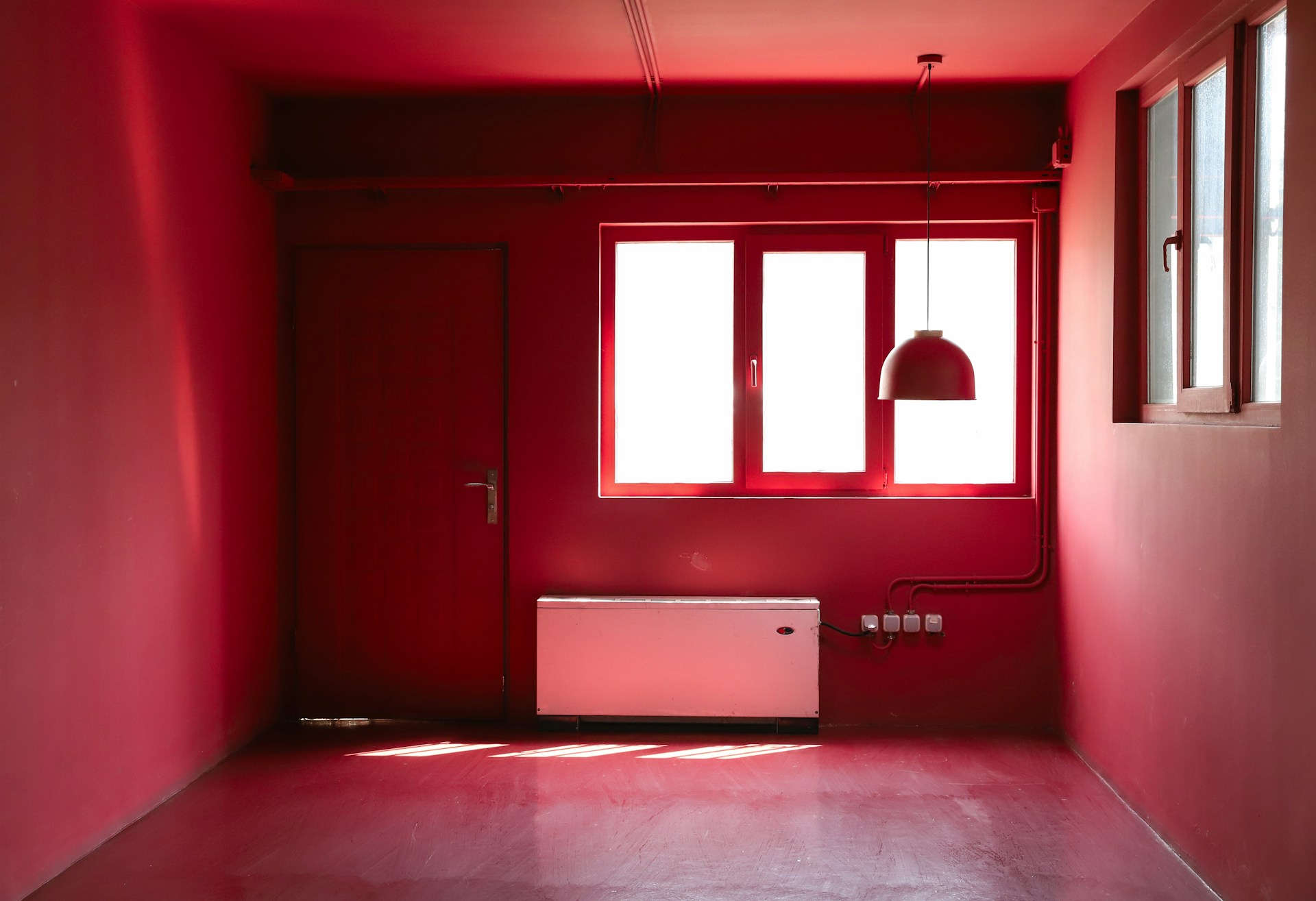
You absolutely must avoid using dark red in a small space. Certainly hot in an XL room, this hue gives the impression that your interior is closing in and your space is burning up. On the other hand, it's so energizing that it can be almost aggressive in a small room.
10. Dark grey, a dull, sad color
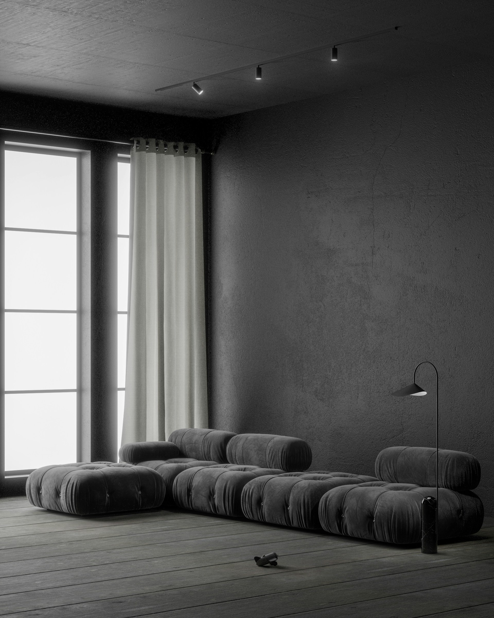
on its own, dark gray is a bland, sad hue that infuses a room with a lack of energy. Applied in excessive quantities to walls, curtains or furniture, it absorbs light and quickly shrinks your space.
11. Fir green: apply in moderation
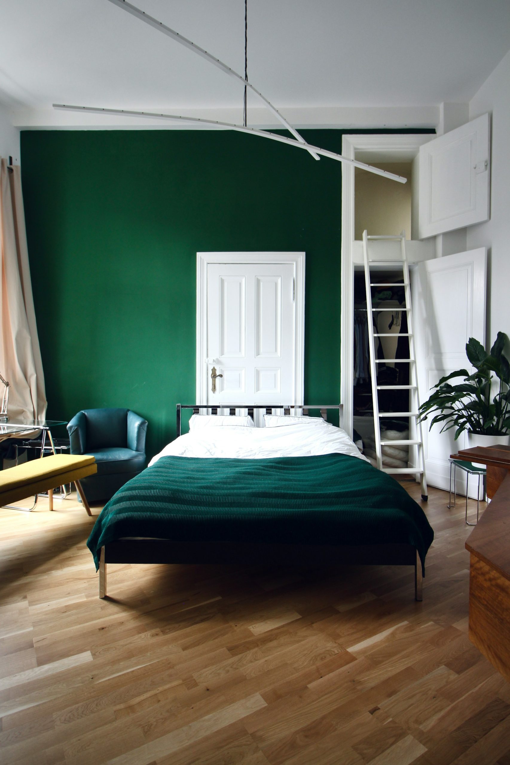
Surprising and original, fir green is a color that should be used sparingly to preserve its freshness. If you apply it throughout your room, you run the serious risk of shrinking surfaces and losing the impression of modernity.
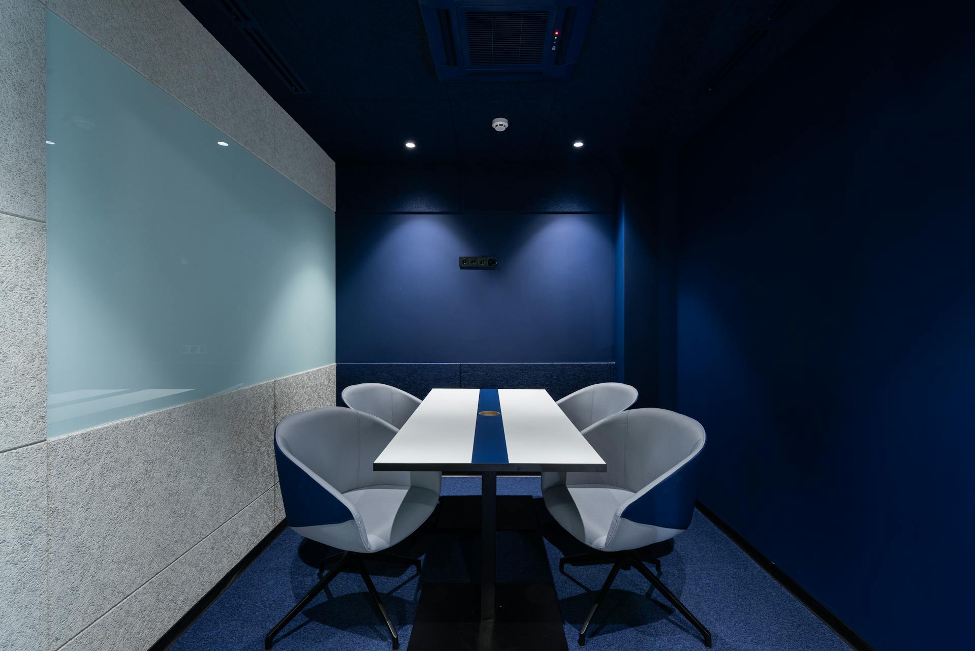
12. Navy blue and its oppressive atmosphere

Like black, this deep shade of blue gives an impression of shrinking space. As it also absorbs natural light, it visually darkens your room and creates an oppressive atmosphere.
13. Dark purple, too stuffy
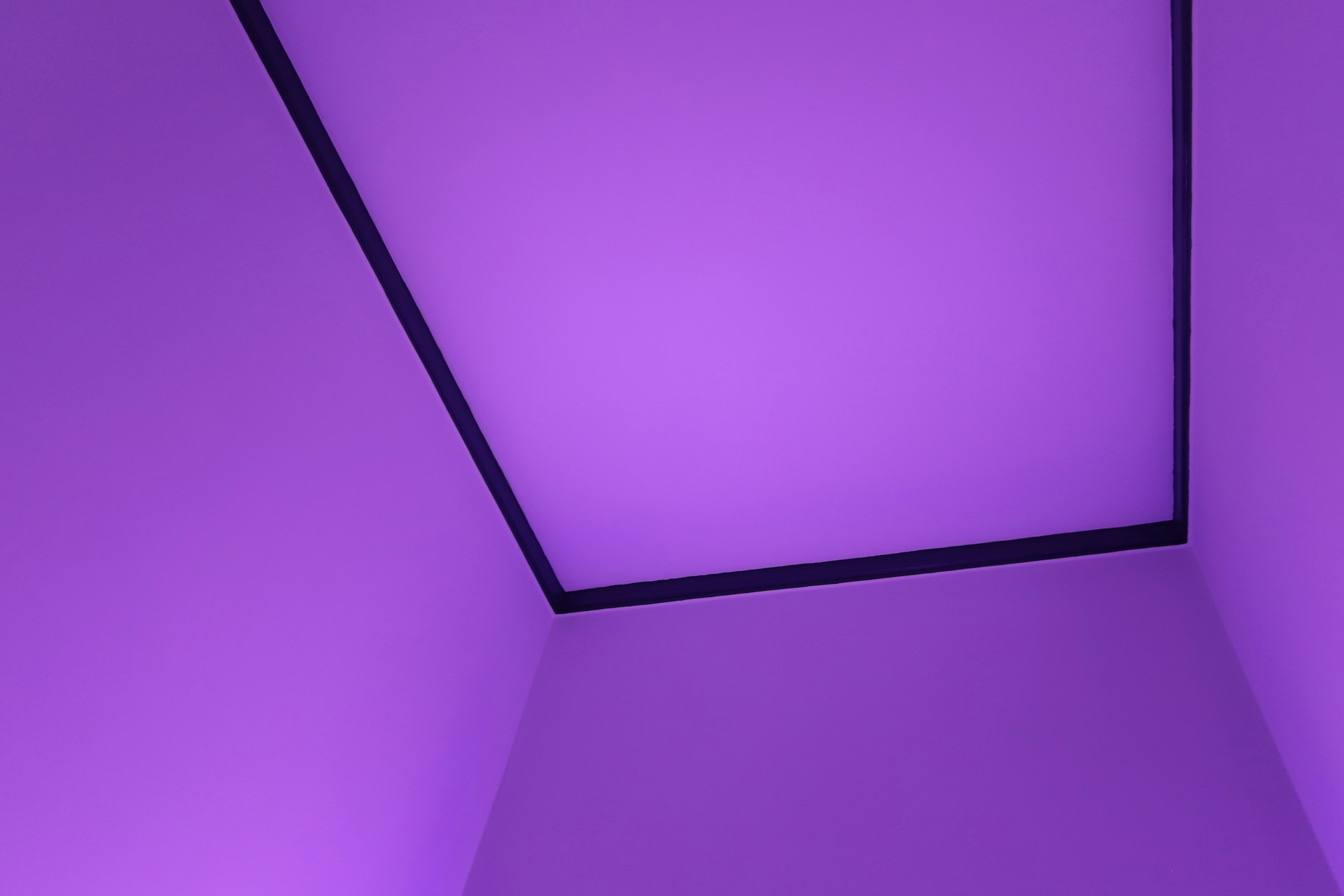
Like other dark shades, dark purple makes your walls feel closer together and your space feel smaller. This makes the atmosphere stuffy and less welcoming.
14. Chocolate brown, too dark
being a dark shade, chocolate brown absorbs light rather than reflecting it, which can make your interior appear darker. What's more, you need to be delicate in choosing the right colors to go with it, to avoid creating a busy visual in a cramped environment.