When minimalist interior décor became popular in the 1960s, it was based on the principle of “less is more.” Quality and function over quantity. It meant simplicity, like a well-placed chair, one sculptural light, and no distractions. The thing is, simplicity can backfire. What’s meant to feel clean and calm ends up looking like someone forgot to finish decorating. There’s a fine line between sleek and soulless, and once you cross it, the whole vibe falls flat. We’re exploring that fine line here: seven designs that make minimalism feel like a luxury and seven that strip so much away that you’re left wondering what the point is. Let’s start with the best, shall we?
When minimalist interior décor became popular in the 1960s, it was based on the principle of “less is more.” Quality and function over quantity. It meant simplicity, like a well-placed chair, one sculptural light, and no distractions. The thing is, simplicity can backfire. What’s meant to feel clean and calm ends up looking like someone forgot to finish decorating. There’s a fine line between sleek and soulless, and once you cross it, the whole vibe falls flat. We’re exploring that fine line here: seven designs that make minimalism feel like a luxury and seven that strip so much away that you’re left wondering what the point is. Let’s start with the best, shall we?
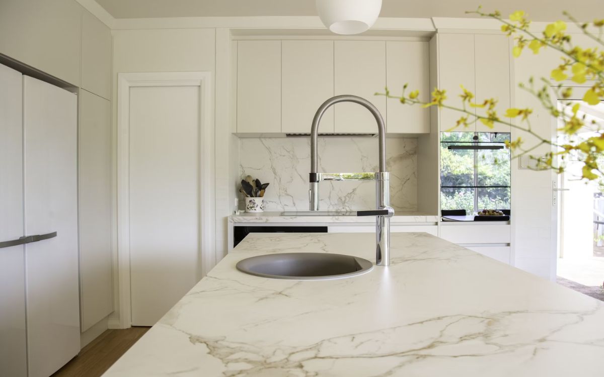
Monochrome With Mixed Textures
Tonal palettes come alive when paired with boucle, marble, and brushed metal. This trio adds depth while staying visually quiet. High-end spaces in NYC and LA utilize this combination to create calm, gallery-like atmospheres. It’s minimalism that feels intentional, not stripped, since the textures bring the warmth that flat white walls simply can’t.
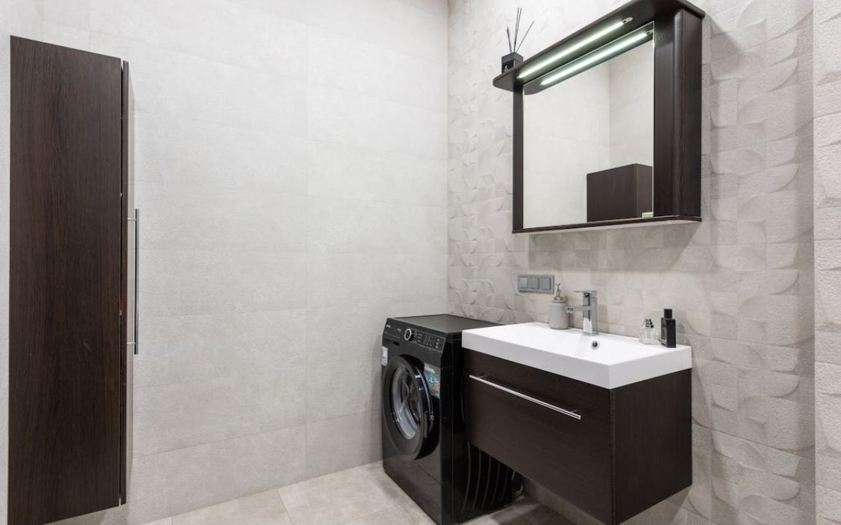
Floating Vanities With Integrated Lighting
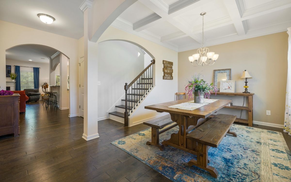
Oversized Art In Neutral Spaces
One oversized piece of art can do more than a dozen knick-knacks. In neutral rooms, it anchors the space with personality but doesn’t clutter. Abstract or monochrome styles also keep the mood serene. Modern penthouses and carefully curated lofts often use this strategy to balance minimal design with bold energy.
Hidden Storage And Paneling
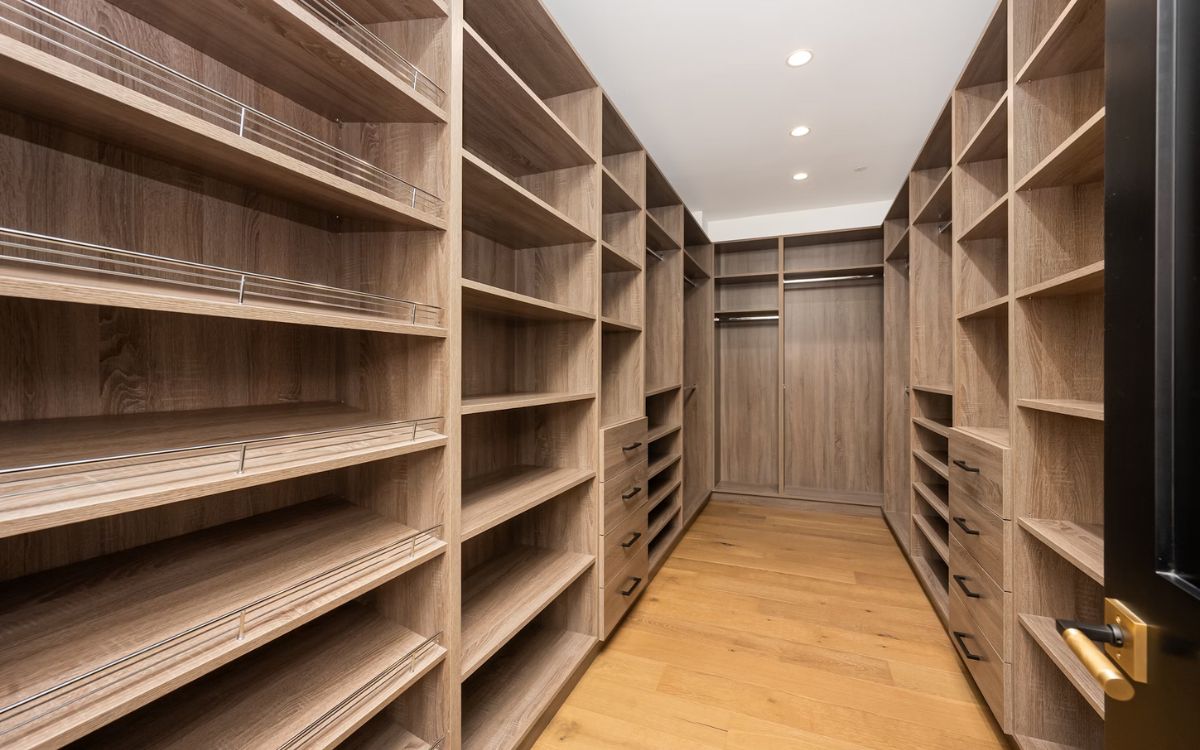
Storage shouldn’t shout. And you can get this with flush cabinetry and hidden doors in matte lacquer, wood veneer, and stone finishes that blend in smoothly. Inspired by Japanese and Scandinavian aesthetics, this look keeps things clean while letting the structure speak for itself. It has everything needed—nothing more, nothing messy.
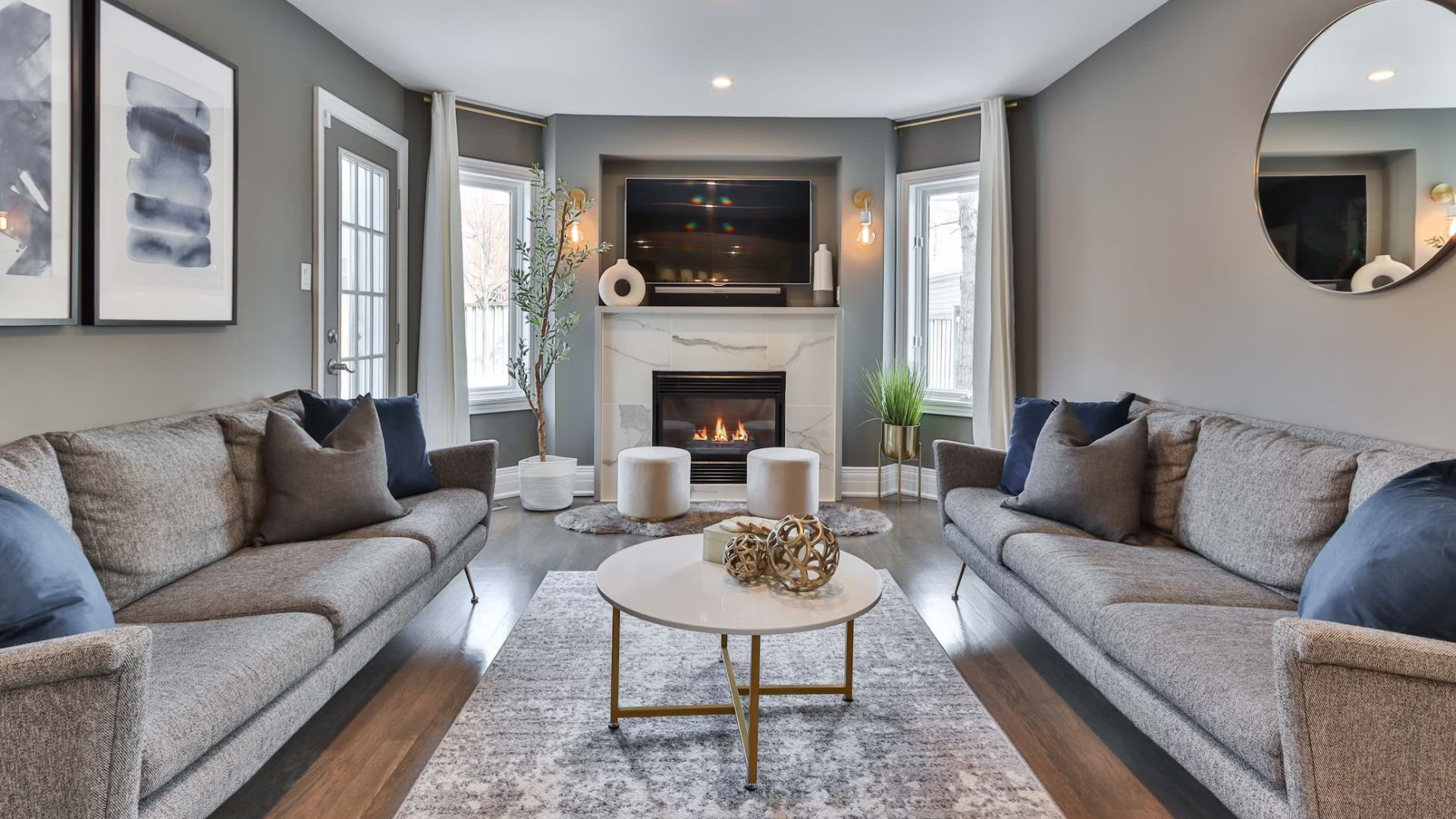
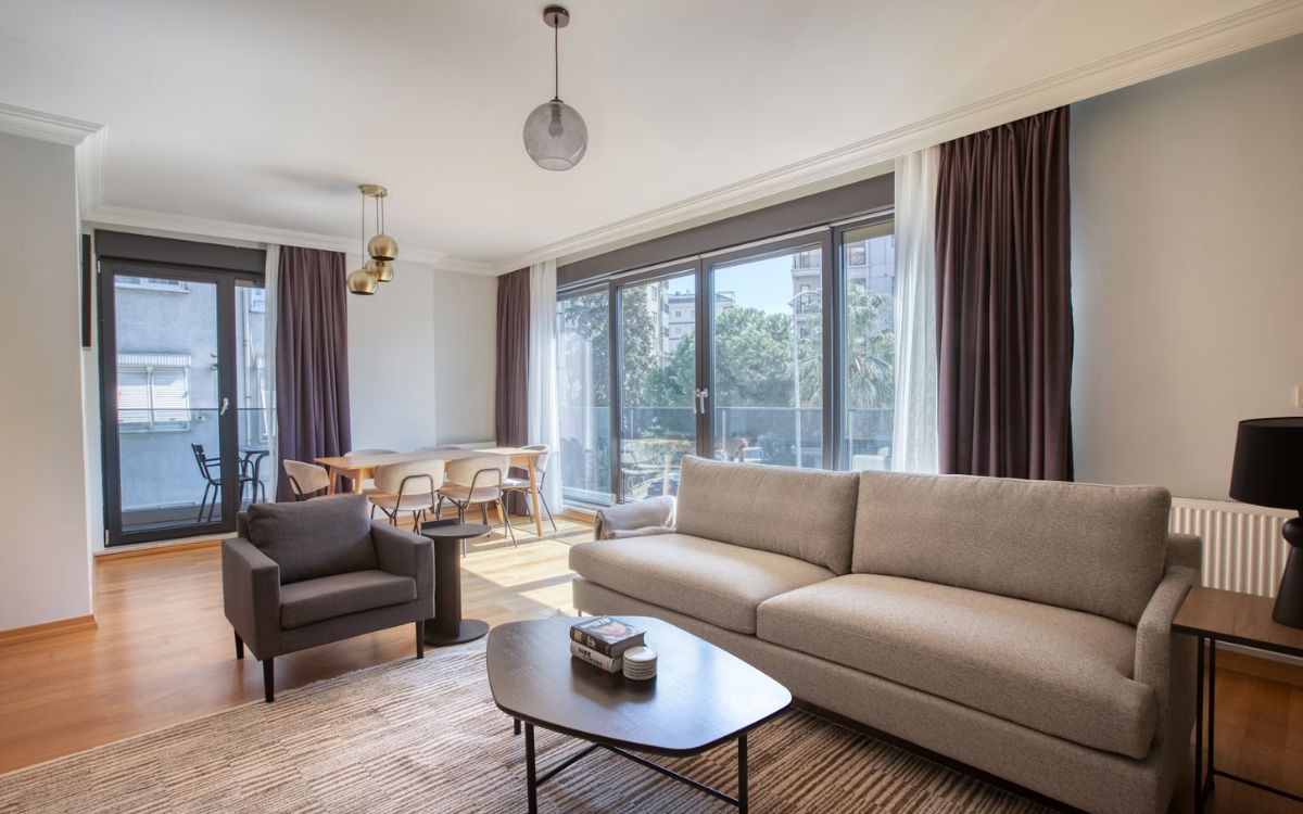
Low-Slung Modular Sofas
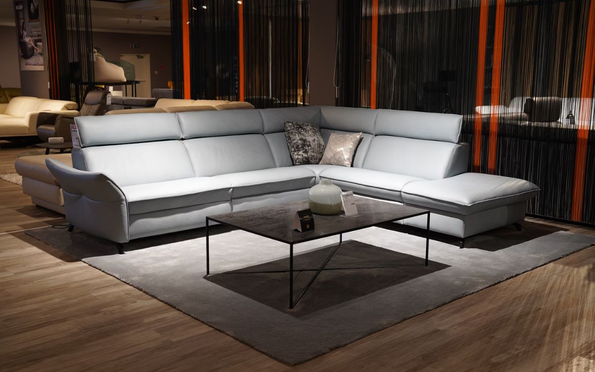
Low-slung modular sofas emphasize horizontal flow and create seamless sightlines. Covered in fabrics like mohair or linen, they offer softness without visual heaviness. Modular options allow flexible layouts. Frequently spotted in boutique hotels and celebrity homes, they’re proof that comfort and minimalism aren’t mutually exclusive.
Frameless Glass Partitions
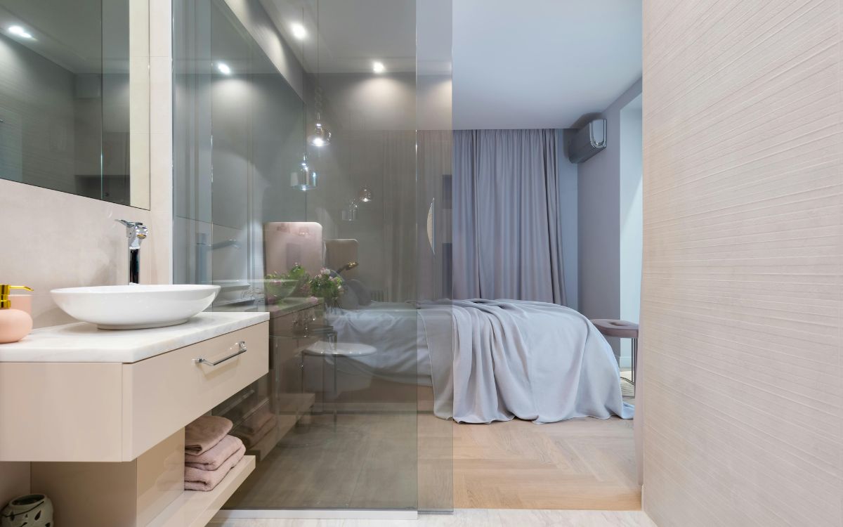
Seeking the hallmark of minimalism? Frameless glass partitions offer just that. They separated sections without severing light or flow. You can use them in bathrooms, stairwells, or home offices because they preserve openness while defining space. Architects love them for the clean lines and structural clarity.
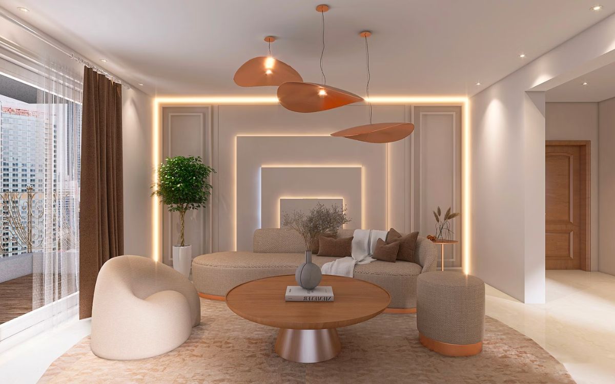
Sculptural Lighting As Focal Point
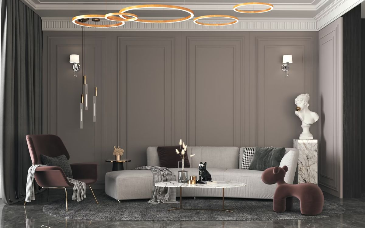
Statement lights aren’t just fixtures—they’re functional sculptures. Made of a variety of materials, these pendants and lamps add elegance without clutter. Popular in AD100 designer spaces, they offer visual drama without shouting. In minimalist rooms, this kind of lighting takes center stage without stealing the whole show.
Now that we’ve seen the sleek and successful side of minimalist luxury, let’s look at where things go wrong—spaces that strip away too much and forget to add the soul back in.
All-White Everything
All-white rooms can feel like blank pages no one bothered to write on. They show every mark, scuff, and shadow, making them hard to live in. While meant to evoke a sense of calm, they often come across as sterile. What’s missing? Warmth and a reason to linger.
Bare Walls With No Art Or Texture
Walls without art or texture don’t breathe sophistication—they just sit there. These spaces skip the chance to ground the room. Often seen in rushed staging or low-effort flips, the result feels impersonal. Minimalism shouldn’t mean leaving the walls out of the conversation.
Ultra-Low Furniture With No Accents
Ultra-low furniture without accents throws the room off balance. Scale suffers, and so does comfort. Instead of calm, the space feels awkward. This look mimics modernism without understanding it. Minimalism needs layering—texture, color, proportion—not just floor-hugging silhouettes that leave everything else hanging.
Excessive Open Shelving
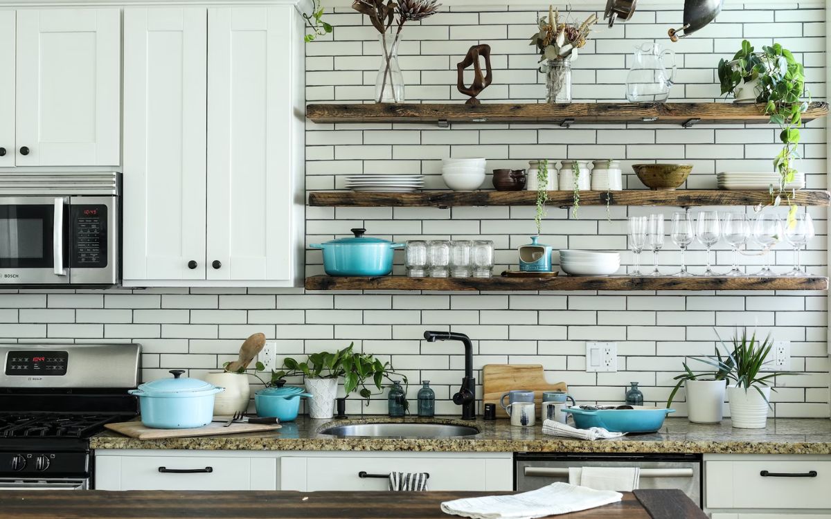
Open shelves might look tidy in magazines, but real life tells a different story. They demand constant upkeep and expose every mismatch. Kitchens and living rooms feel busier and all over the place, not better. Often used to cut costs, they ignore a core minimalist goal: visual peace.
Empty Corners With No Purpose
Empty corners shouldn’t exist in luxury design. They feel forgotten. Especially in oversized homes, these dead zones make even expensive materials look unfinished. One well-placed chair, sculpture, plant, or floor lamp could change that. Minimalism still needs punctuation, and corners are the perfect spot.
Matte Black Overload
Matte black was once a bold choice. Now, it’s often overdone, especially in spec builds. When everything is black—from fixtures to furniture—it absorbs light and flattens the room. What started as sleek ends up somber. Luxury design thrives on balance, and this isn’t it.
Matching Furniture Sets
Matching sets make a space feel like it was shipped from a catalog, not lived in. While they promise cohesion, they kill character. Fast-furnished apartments fall into this trap often. High-end minimalism thrives on contrast and restraint, not mass-produced repetition. Break the set. Mix it up.