Categories
Mobile Syrup

Google’s refreshed Gmail interface arrives for more users

Google has been slowly rolling out its new Gmail design to desktop users over the last few weeks and months — now it’s headed to all Gmail users who have ‘Chat’ turned on.

As per Google (via Android Police), this is the latest stage of a rollout that began earlier this year. Google first announced the new design for Gmail in January, then made it available on an opt-in basis. In June, it released the new Gmail to desktop users on an opt-out basis, and now it’s going to arrive for all users with Chat. Anecdotally, the new Gmail briefly arrived on my personal Google account and has since vanished. I am not sure how or why.

Anyway, the new layout — if you’ve somehow managed to make it this long without seeing it — adds some nice Material You-style theming to Gmail, adds a sidebar for quickly jumping between Mail, Chat, Spaces, and Meet, adds conversation bubbles, and more.

Alongside the visual refresh, Google also detailed that it’s making Gmail search more powerful. In practice, that means you’ll see helpful new search ‘chips’ (those little suggestion bubbles you see popping up all through Google apps and Android), options to quickly narrow search results, and more.

On top of that, Google says it will enhance Gmail search with “contextual contact suggestions with intent matching for names and email addresses.” That should help improve the results when trying to find a contact in Gmail. Finally, Google’s enhancements will add personalized suggestions to search results based on how frequently users interact with a person in Gmail.

Google rounded things out with a promise that it will launch an improved Gmail experience for tablet users, better emoji, new accessibility features, and more.

Source: Google Via: Android Police

Categories
Mobile Syrup

Finally, Google is redesigning the Play Store website

Finally! Google is reportedly redesigning the web version of the Play Store, a change that’s been a long time coming.

Android Police reports that the redesign is part of a server-side switch and isn’t widely available yet. Some people have had luck changing their Play Store to a different location (Korea and Taiwan reportedly work, although I couldn’t replicate it myself).

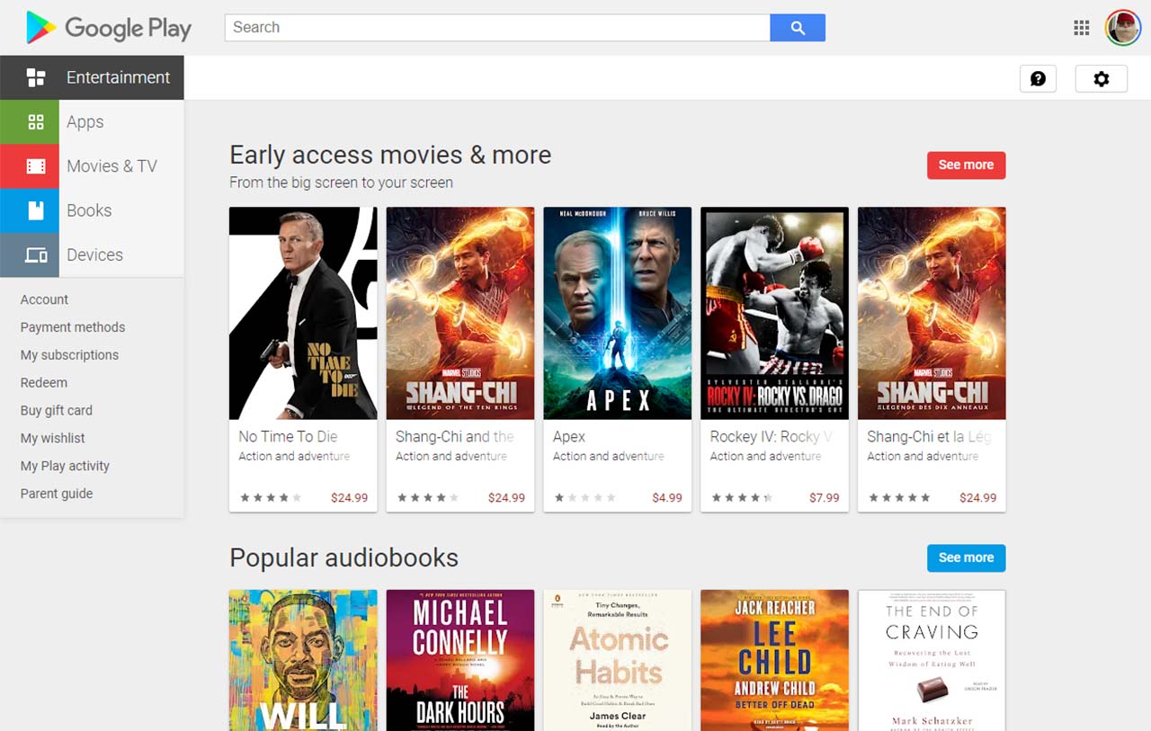
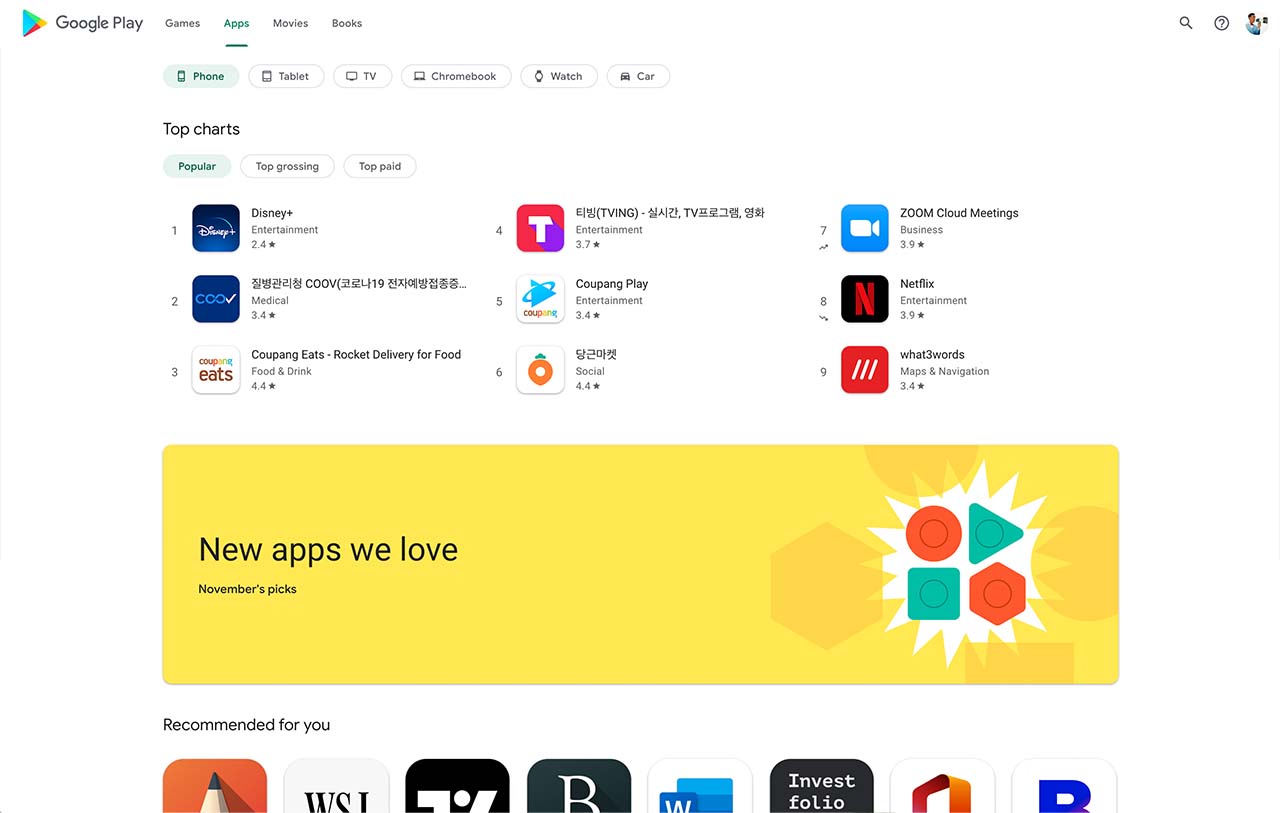
Regardless, Google redesigned Play Store goes from the old look (from the early days of Material Design) to what appears to be the current Play Store design blown up for larger displays. It generally looks good, although it really does look like the mobile Play Store stretched out for big screens on individual app pages.

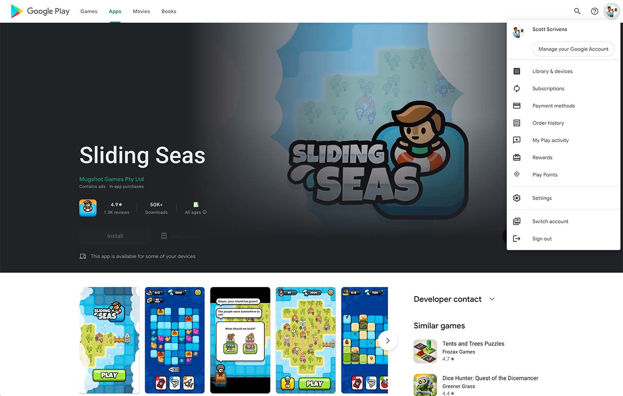
Beyond that, there’s not a lot to say about the new Play Store design beyond that it’s modern, for better and worse. There’s now a navigation bar along the top for switching between apps and games. The Google account switcher in the top-right corner now hides a menu with access to subscriptions, order history and more.

The Games page features auto-playing trailers, there are scrollable screenshot galleries and more. Unfortunately, some aspects of the new design don’t work, likely due to the Play Store redesign being a work-in-progress still.

While I’m certainly excited for a refreshed Play Store website, I’m not sure how significant of a change it’ll be. I really only use the Play Store site to grab links to apps and games when I want to include them in stories I write for MobileSyrup — which, frankly, happens a lot.

In other words, your average user might not spend much time messing around with Play Store on the web. Regardless, the updated design is a move in the right direction and should further help unify Google’s web products.

Source: Android Police