Complete guide to choosing and combining 15 neutral colors in interior design: principles, harmonies, and practical examples

Neutral colors are the backbone of interior design. They are not boring: when chosen well, they structure the space, enhance materials, and make it easier to introduce colorful accents. This practical guide reviews the principles you need to know to select a neutral color that suits your interior, suggests reliable combinations, and illustrates each tip with visual examples. Why choose a neutral color? A neutral color stabilizes a room. It creates a coherent and lasting atmosphere—essential if you like to update your accessories without redecorating the entire room. Pure white, off-white, beige, taupe, light gray, or charcoal: each shade has its own personality. The choice depends mainly on the brightness, the materials present (hardwood, stone, metal), and the desired ambiance (warm, minimalist, contemporary).
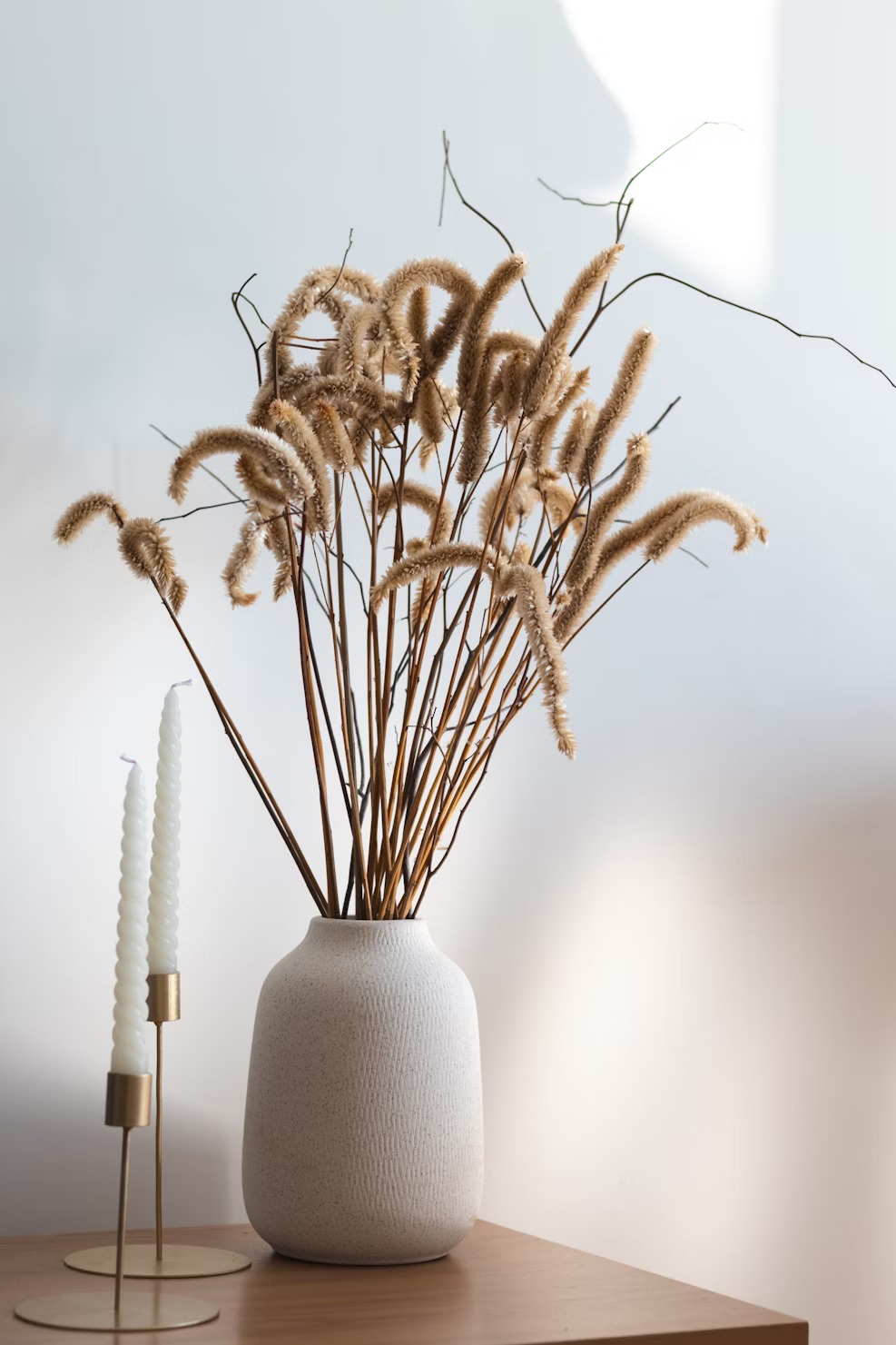
 Use off-white or pearl white in dark rooms to capture light without the coldness of pure white. For spaces that are already well lit, shades such as beige, linen, or ivory bring warmth and softness.
Combining neutrals: simple rules
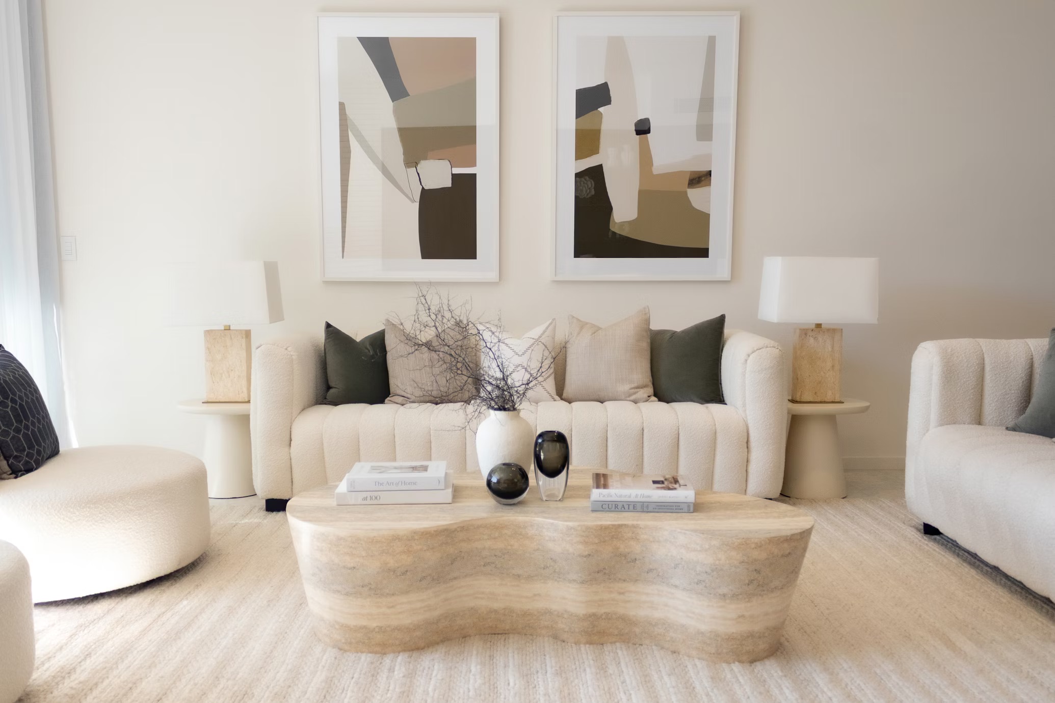
- Play with contrasts in value: combine a light shade (off-white, ivory) with a deeper shade (taupe, charcoal) to add depth.
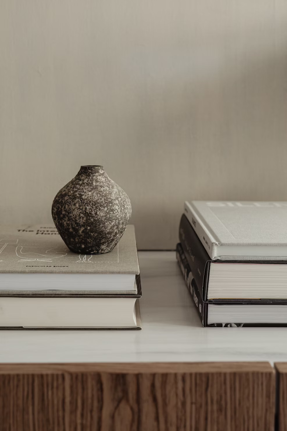
- Vary textures: a monochrome ensemble rich in textures (linen, wool, raw wood, metal) looks more sophisticated than a single smooth surface.
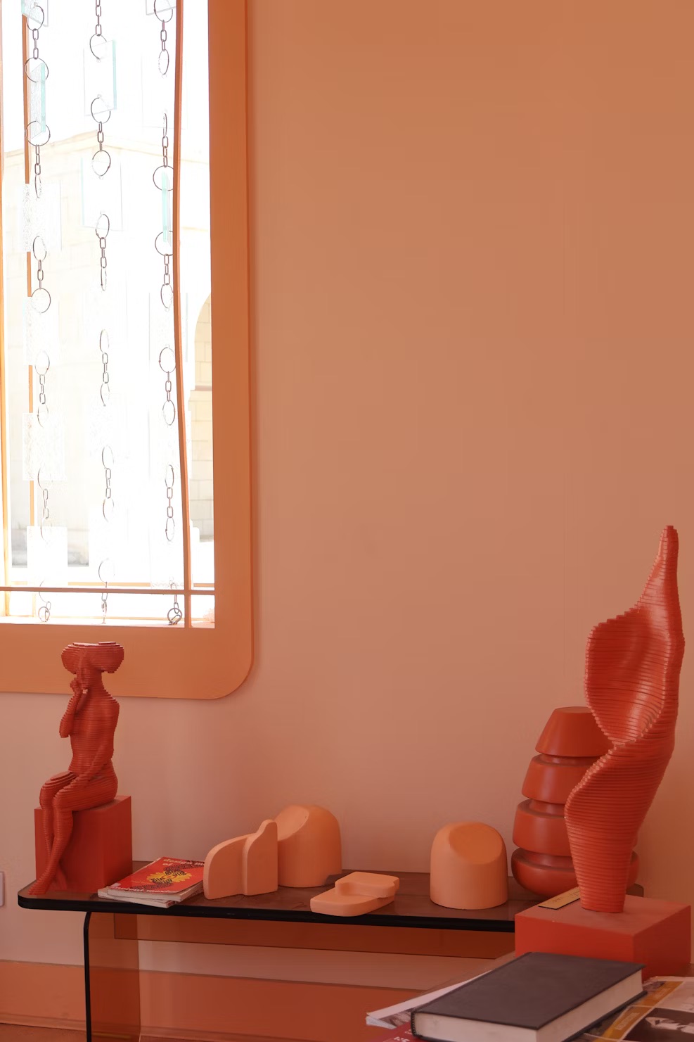
- Add a colorful accent: a green cushion, a deep blue painting, or a terracotta vase is enough to liven up a neutral palette.
 Practical example: For a contemporary living room, paint the walls in greige or off-white, install a beige sofa, and add an anthracite armchair for depth. Complete the look with light wood accessories and a textured rug. You’ll end up with a space that’s both warm and graphic.
Choose according to the room
- Bedroom: opt for enveloping tones (beige, linen, ivory) to promote rest.
- Living room: opt for a light base (pearl white, off-white) and an accent wall in taupe or clay to structure the space.
- Kitchen: pure white or off-white remains classic, but light gray or sand-colored cabinet fronts add a modern touch.
 Charcoal gray and dark neutrals: Be bold with charcoal gray for a strong visual impact: it enhances shapes and creates a dramatic backdrop for colorful accents or light wood pieces. However, be sure to maintain sufficient light sources and balance with light touches.
Technical tips
- Always test samples in situ: natural and artificial light greatly alter the perception of a color.
- Consider the finish: the same pigment looks different in matte, satin, or glossy finishes.
- Harmonize undertones: a neutral with warm undertones (beige, ivory) goes better with warm materials; a neutral with cool undertones (light gray) will enhance a contemporary atmosphere.
In conclusion, mastering a palette of neutrals means mastering light, texture, and contrast. These colors give you the freedom to transform the atmosphere with small touches (a cushion, a frame, a textile) without compromising the coherence of your interior. Experiment, layer, and let the materials speak for themselves: the right neutral palette will enhance both your furniture and your lifestyle.
Images: a few examples for inspiration: