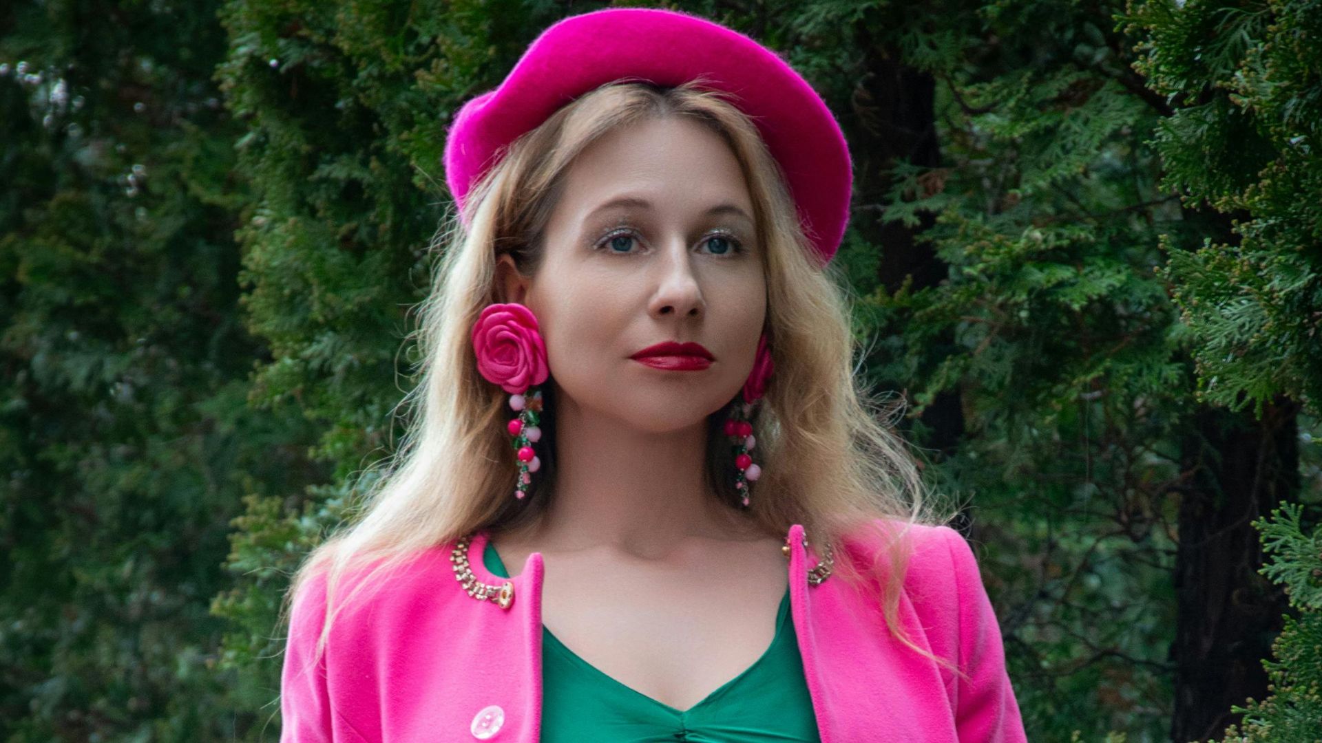
Have you ever stared at an outfit or maybe your house, wondering which colors won't clash horribly? Well, color pairing can feel like total guesswork. One wrong move and your carefully planned vision turns into an eyesore that makes people squint.
Thankfully, a few combinations have stood the test of time, working flawlessly across fashion, interiors, branding, and art. These are proven pairings that deliver visual harmony every single time—backed by psychology and countless successful applications.
If you never want to second-guess your palette choices again, keep reading. This roundup explores the foolproof duos that'll make you look like a color theory genius.
Navy Blue + Gold
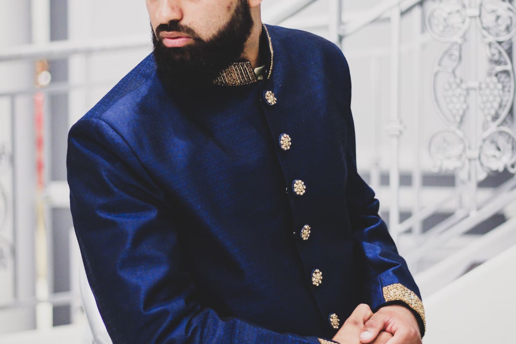
Navy blue conveys trust and professionalism, which is exactly why corporate branding and uniforms lean on it so heavily. Add gold's association with wealth and achievement, and you create instant opulence. This combination appears everywhere, from award ceremonies to luxury branding, because it screams prestige without saying a word.
Forest Green + Blush Pink
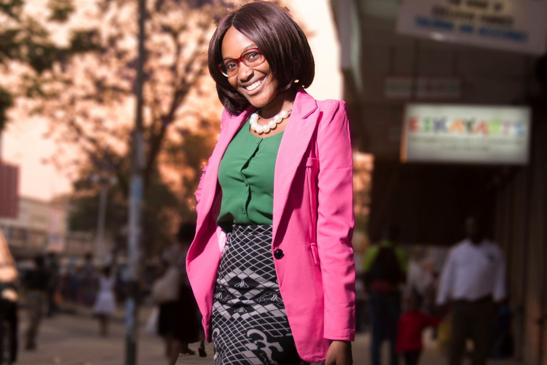
Nature meets modern romance in this unexpected combo. Forest green brings growth and tranquility that eco-friendly and wellness brands absolutely love. Blush pink exploded as a wedding and interior trend throughout the 2010s, adding tenderness and understated elegance that softens green's earthiness. The contrast between bold and delicate makes this pairing endlessly versatile across design applications.
Charcoal Gray + Mustard Yellow
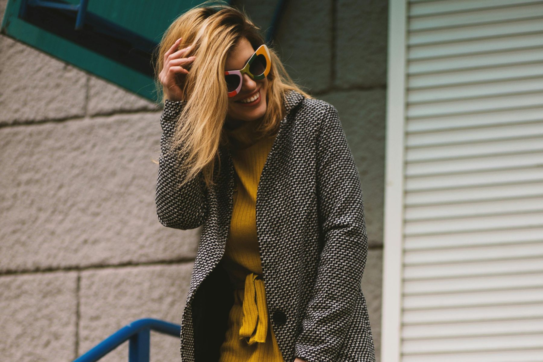
Here's where sophistication gets a jolt of energy. Minimalist and industrial designers reach for charcoal gray to create depth without competing for attention. Mustard yellow jumps in with warm, retro flair that dominated 1970s fashion and interiors. The neutral gives the vibrant shade room to breathe, while the yellow prevents things from feeling too austere.
Burgundy + Cream
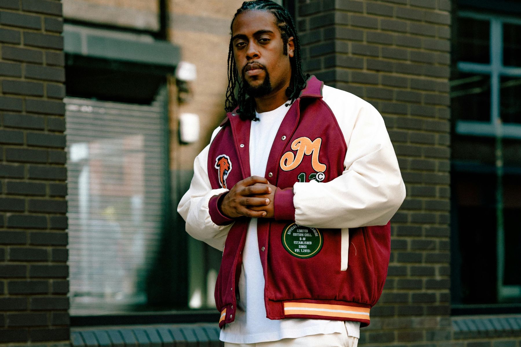
Wine from France's Burgundy region inspired the color, marking its luxurious reputation. This deep red with purple undertones delivers instant sophistication and tradition. Cream, the go-to for wedding dresses and formal spaces, softens burgundy's intensity beautifully. Together, they form a classy duo.
Teal + Coral
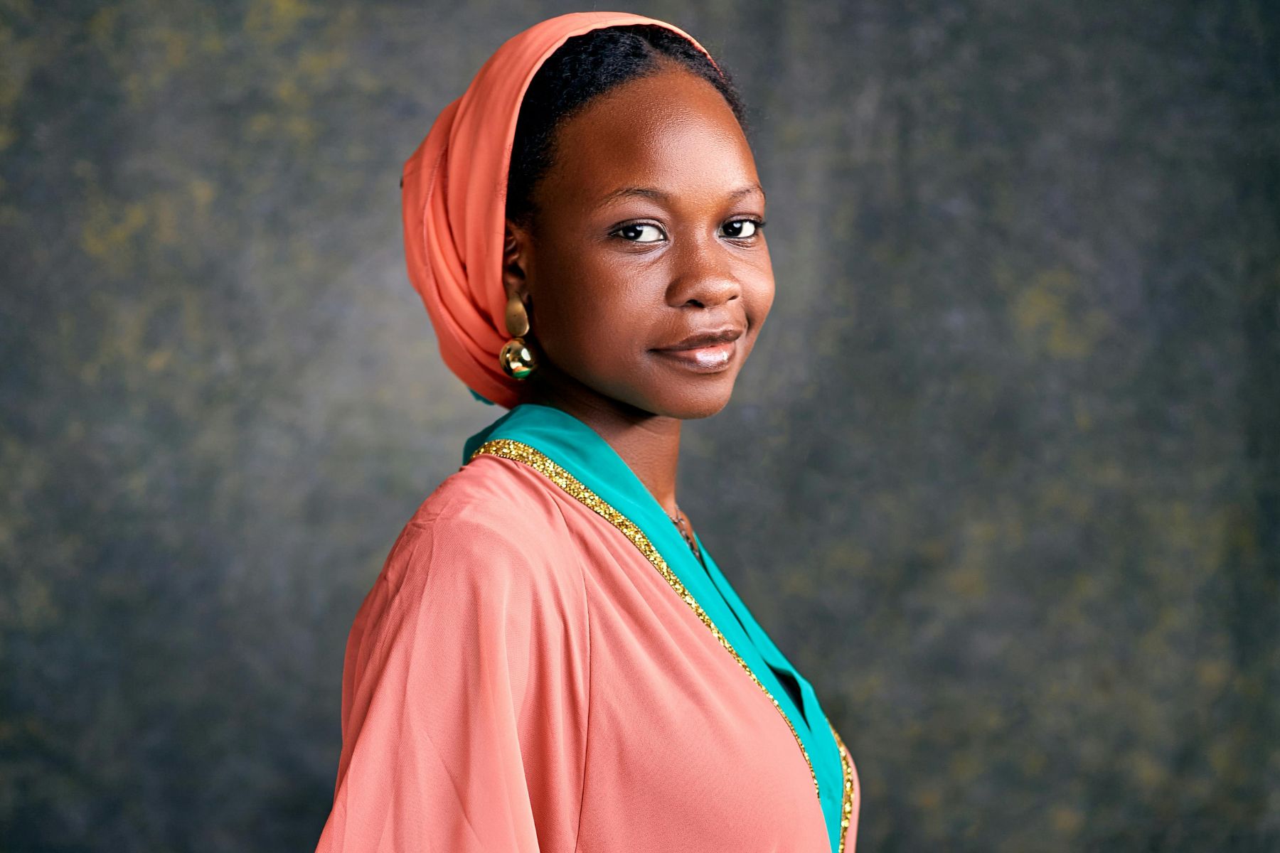
Pantone crowned coral as Color of the Year in 2019, celebrating its vibrant warmth. Pairing it with teal creates pure magic: The blue-green shade represents clarity, rejuvenation, and creativity that other colors can't match. Coral's pink-orange playfulness brings energy that lifts teal's cooler tones. This combo feels simultaneously tropical and modern, working beautifully in everything from branding to interiors.
Black + White
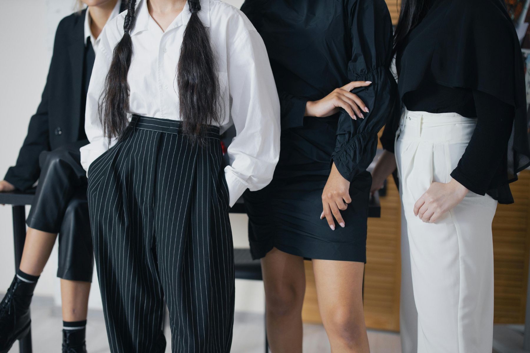
The foundation of graphic design, photography, and fashion needs no introduction. Black commands with power and class; white creates contrast and breathing room. Classic black and white photography still gets celebrated for its dramatic impact decades after color became standard. These shades work because of that simple yet striking contrast that catches the eye.
Terracotta + Sage
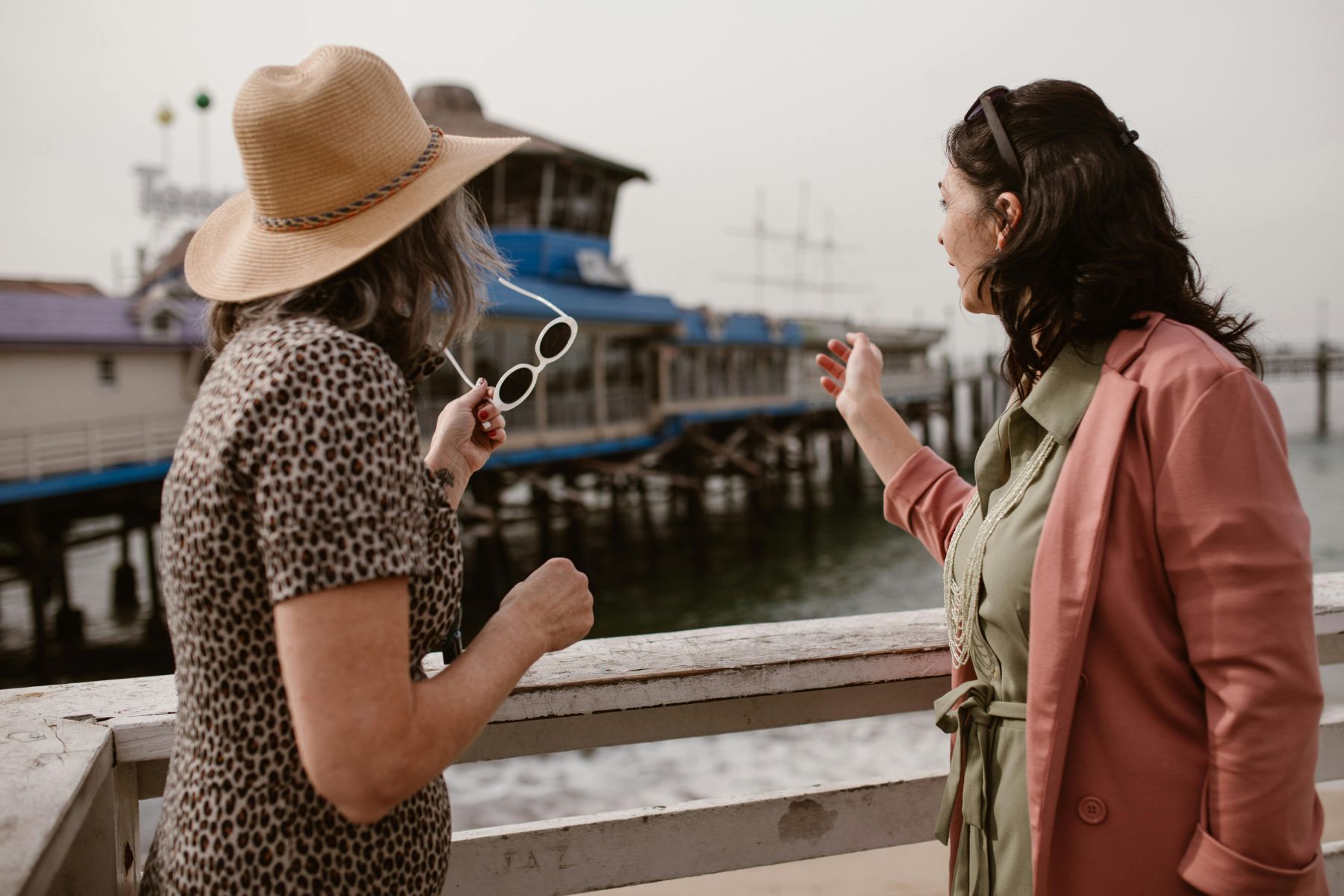
Terracotta's reddish-brown warmth has graced Mediterranean architecture and pottery for thousands of years, creating instant rustic charm. Sage brings muted grayish-green calm beloved in spa and wellness branding for its soothing qualities. The balance between earthy warmth and natural serenity feels both ancient and incredibly current—that’s Earth tones done right!
Cobalt Blue + Tangerine
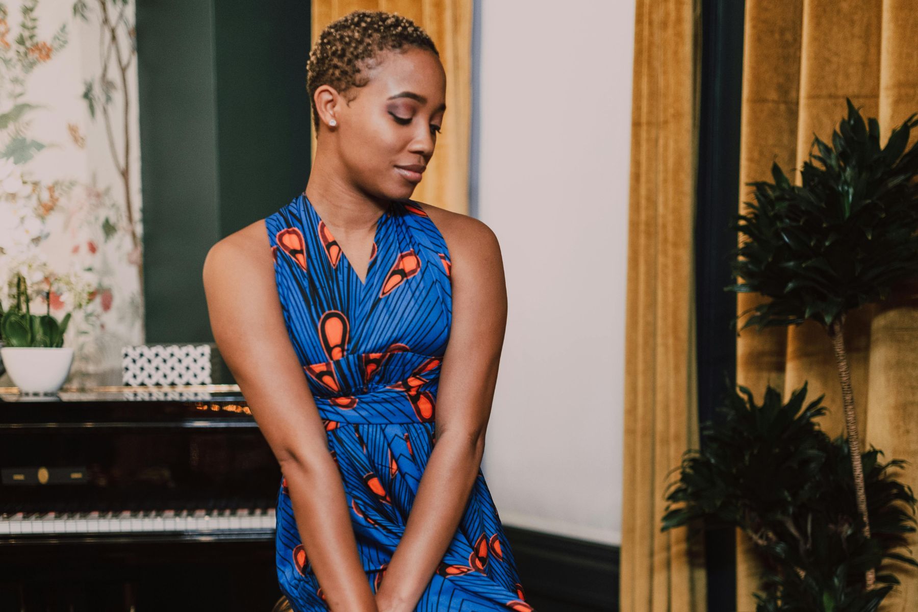
Designers historically prized cobalt blue pigment for its unmatched intensity, and that vivid saturation still conveys energy and confidence today. Tangerine became a mid-century modern staple, adding bright, zesty warmth. The temperature contrast creates visual excitement without chaos—each color makes the other pop harder.
Lavender + Mint Green
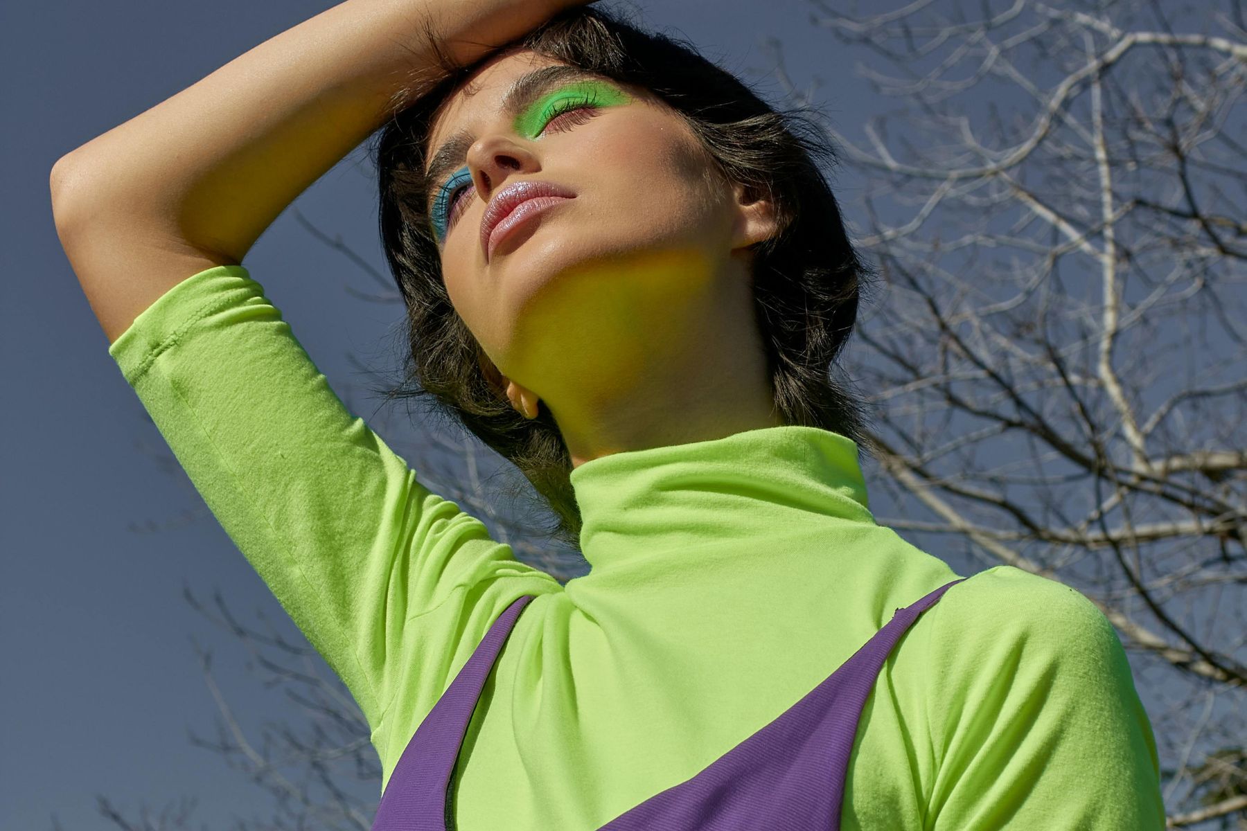
Soft, pale purple meets pastel freshness in this soothing combination. Lavender gets used constantly in aromatherapy for its calming properties. It also symbolizes grace and femininity. Mint green dominated 1950s kitchens and diners as a sign of modernity and cleanliness. Together, they create an airy, graceful aesthetic, perfect for spaces meant to relax and restore without feeling saccharine.
Chocolate Brown + Sky Blue
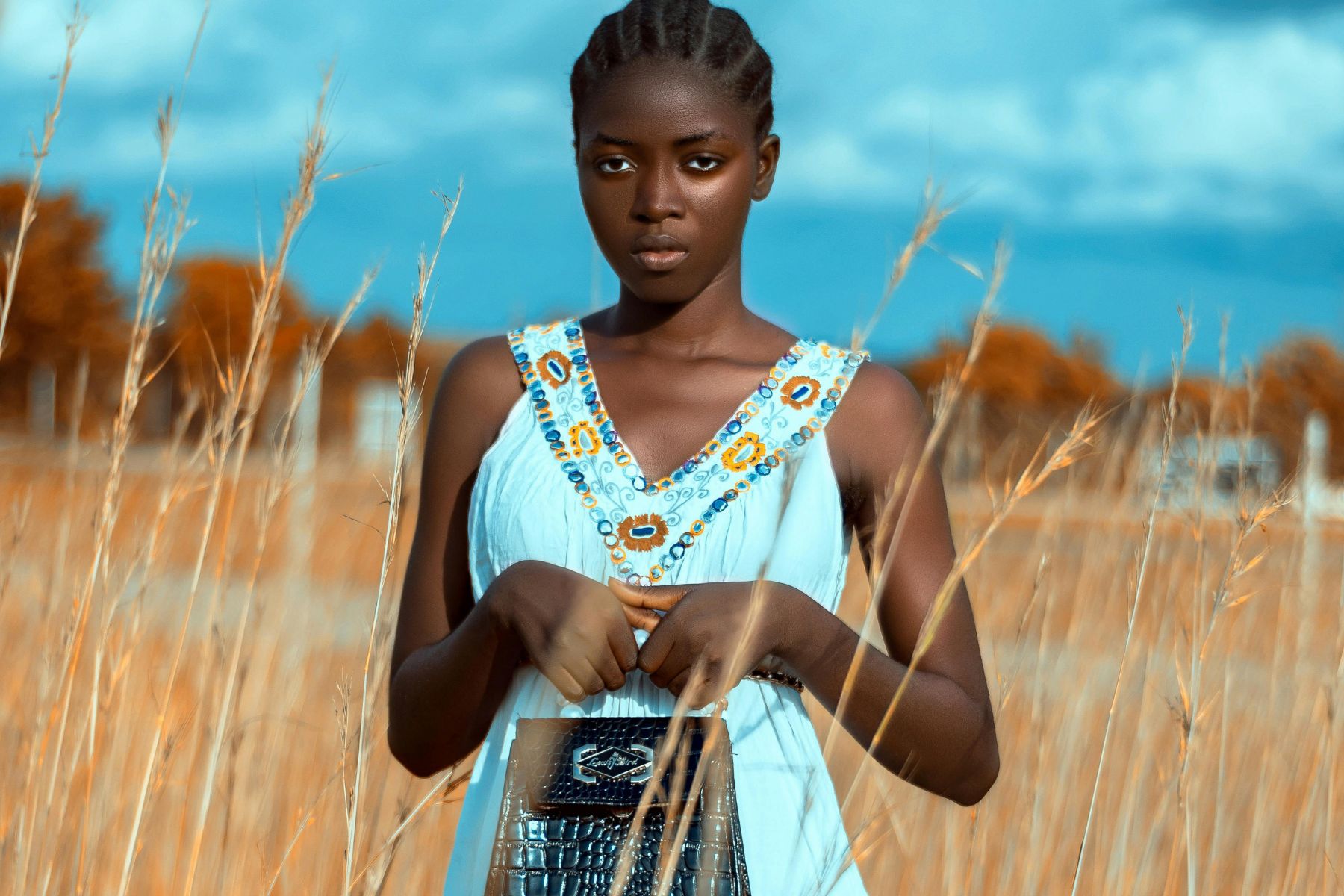
Organic and natural product branding loves chocolate brown because it instantly communicates honesty and reliability. That deep, rich warmth conveys the comfort people naturally trust. Sky blue brings light, airy optimism that's remained a classic for baby products and nurseries. The earthiness grounds the airiness, while the blue keeps brown from feeling too heavy. Its stability meets hope.
Maroon + Champagne
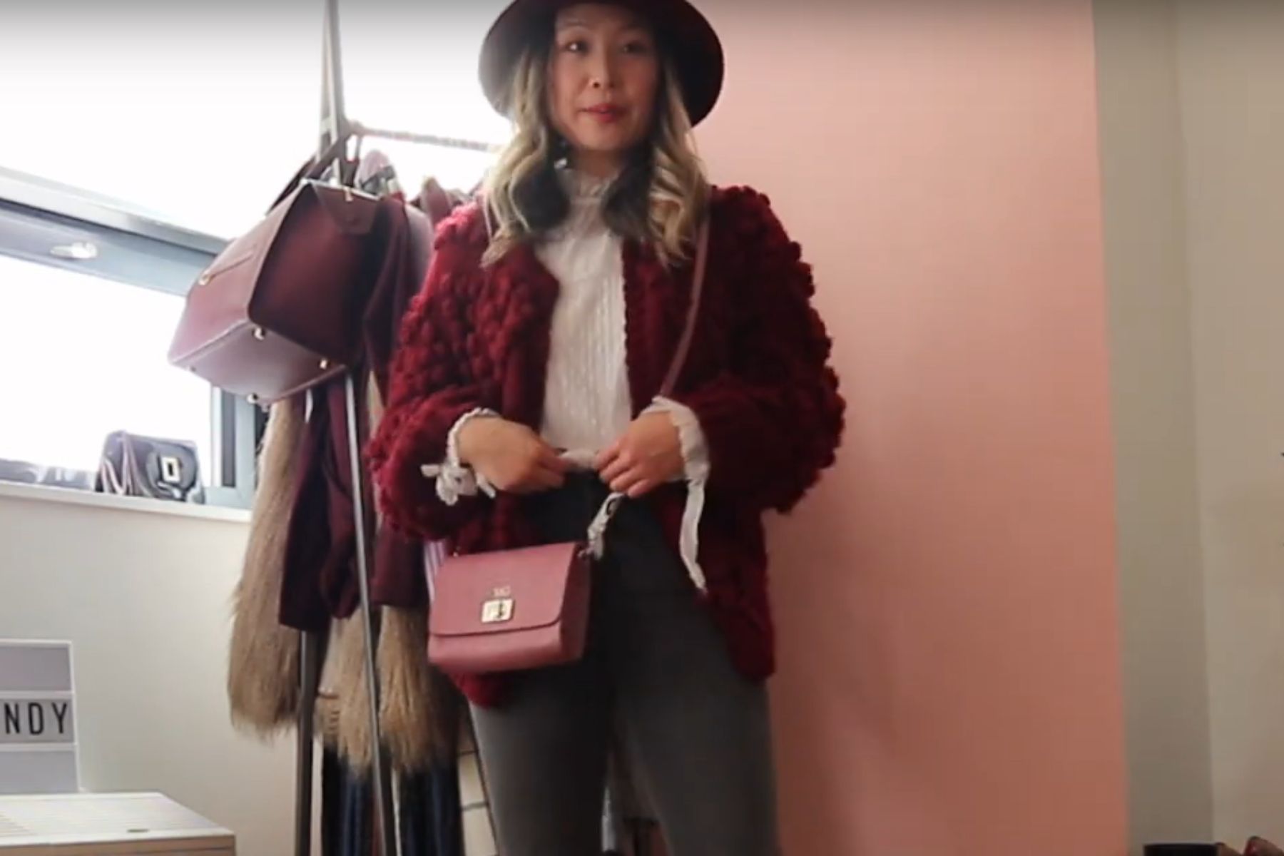
Maroon appears everywhere in academic regalia, signifying tradition and sophistication with its deep reddish-brown strength. Champagne adds pale, warm beige with golden undertones that evoke luxury and celebration—event designers reach for it constantly. Maroon’s strength needs champagne's lightness to feel celebratory rather than somber, to strike the right balance for formal occasions.
Peach + Emerald Green
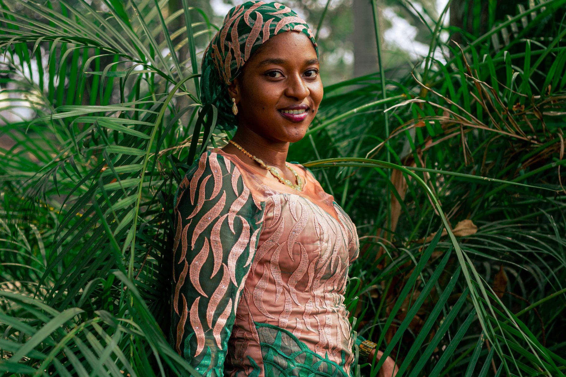
Pantone declared emerald green its 2013 Color of the Year for good reason. That rich, jewel-toned brilliance hints at prosperity and vitality like no other shade. Peach, a defining 1980s fashion color, radiates soft warmth and approachability. In this combo, the jewel tone gets grounded by peach's sweetness, creating a bold yet inviting look.
Burnt Orange + Taupe
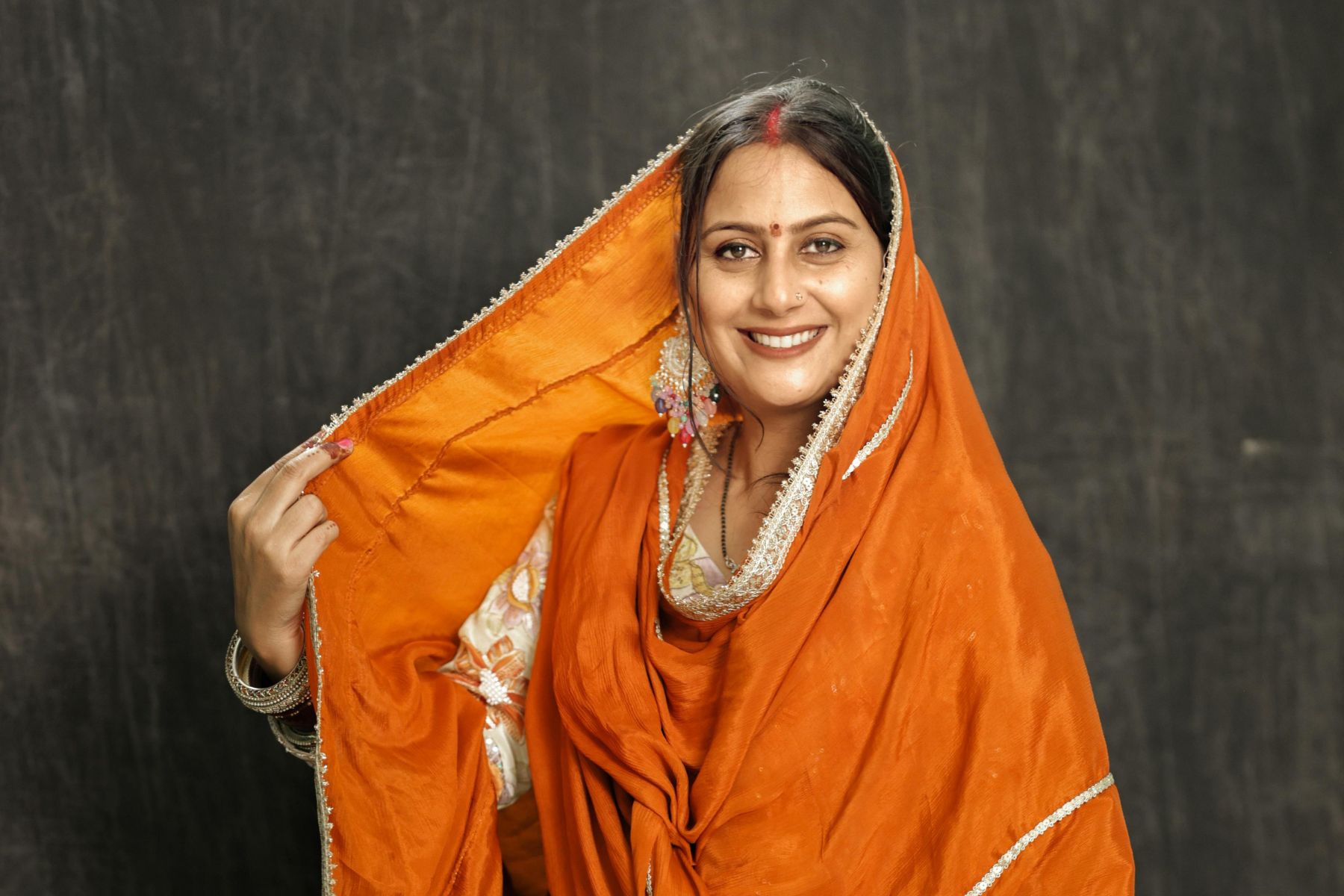
The 1970s established burnt orange as a signature color, and its reddish-orange charm still brings the coziness of fall. As for Taupe, it provides grayish-brown sophistication and versatility that prevents orange from overwhelming any space. So, this pairing feels grounded and warm, without skewing too rustic or too modern. It’s best if you’re aiming for an inviting look.
Plum + Silver
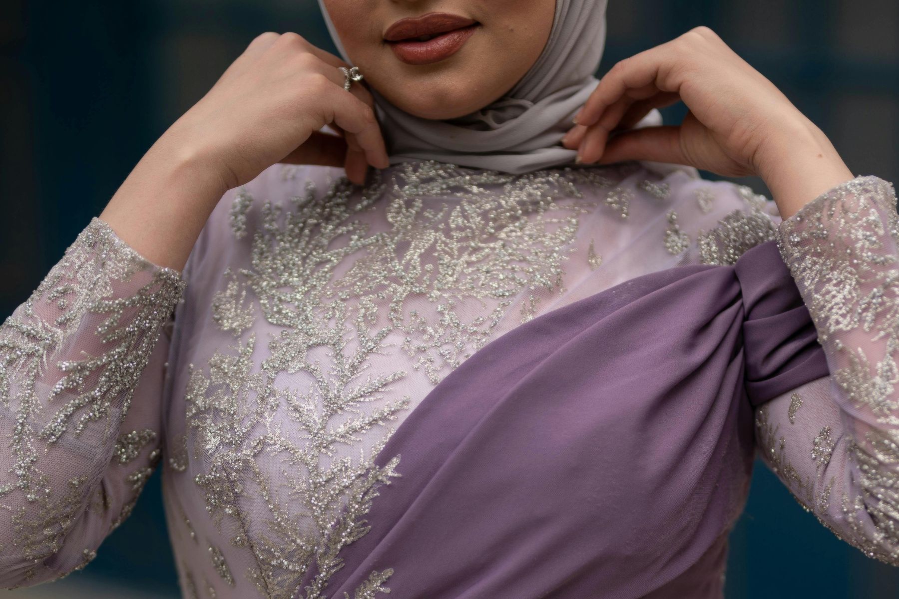
Deep purple-red sophistication plus shiny edge. Plum dominates eveningwear and luxury branding for its creative depth and striking presence. Silver's cool, metallic gray modernity is associated with high-tech design, futuristic concepts, and achievement. That warm-and-cool contrast lets you add drama while being classy.
Turquoise + Terracotta
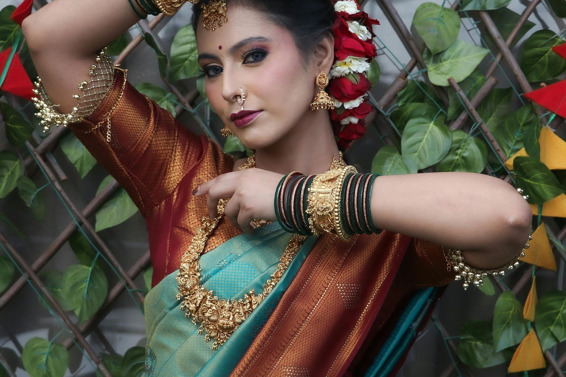
You'll find this combo in many Bohemian styles. Turquoise has been prized in jewelry and art for thousands of years, evoking the sea and effortless tranquility with its blue-green magic. Terracotta has anchored architecture and pottery since ancient times, especially in warm climates. This pair creates a relaxed-but-put-together vibe that feels like a permanent vacation.