A dashboard can upgrade the entire driving experience or bring it crashing down before the car even moves. It’s one of the first things you see and touch, shaping your impression in seconds. That single space can feel like a high-tech lounge—or a cluttered afterthought. Some brands have pushed boundaries with sleek interfaces and smart design choices. Others got lost trying to be different and ended up with layouts that puzzled more than they pleased. The contrast between these approaches says everything about priorities, vision, and how much a brand really understands its drivers. Let’s start with the dashboards that stand out for all the right reasons. They go beyond function and bring a sense of purpose to the cabin.
A dashboard can upgrade the entire driving experience or bring it crashing down before the car even moves. It's one of the first things you see and touch, shaping your impression in seconds. That single space can feel like a high-tech lounge—or a cluttered afterthought. Some brands have pushed boundaries with sleek interfaces and smart design choices. Others got lost trying to be different and ended up with layouts that puzzled more than they pleased. The contrast between these approaches says everything about priorities, vision, and how much a brand really understands its drivers. Let’s start with the dashboards that stand out for all the right reasons. They go beyond function and bring a sense of purpose to the cabin.
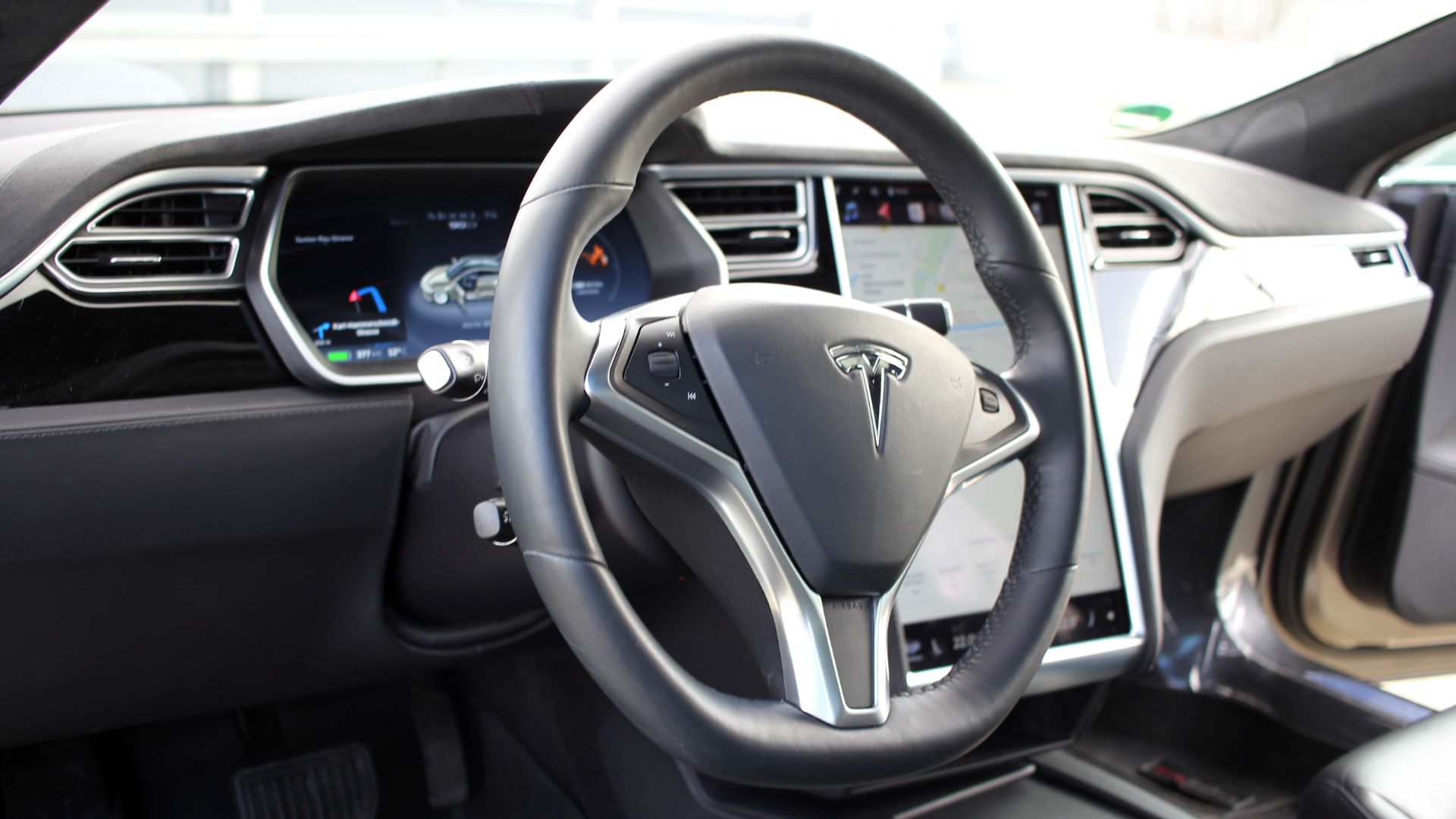
Tesla Model S
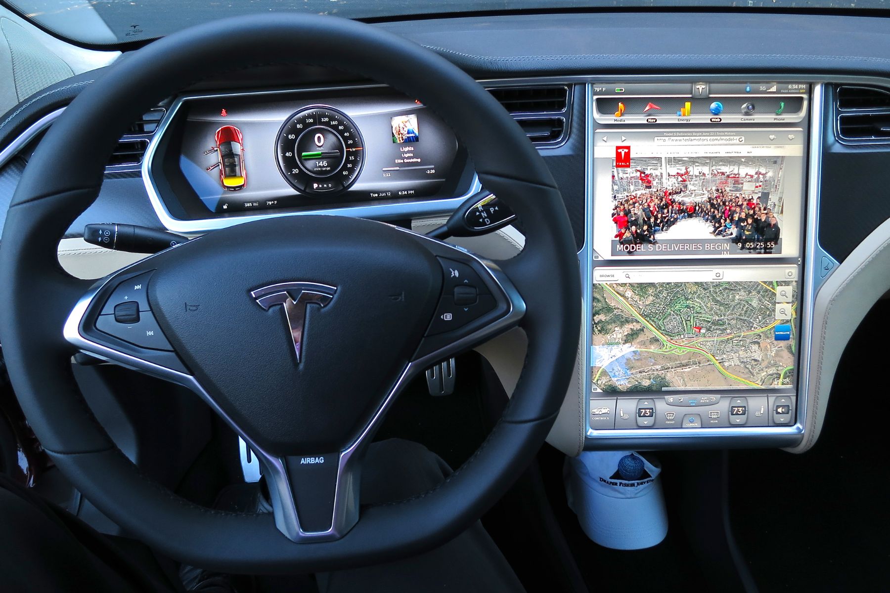
Tesla shook up the industry with its 17-inch touchscreen dashboard with no buttons in sight. It functions like a giant tablet, receiving remote updates that refine everything from interface to performance. This futuristic setup nudged the entire auto world forward and forced competitors to rethink how a car's dashboard should look and function.
BMW iX
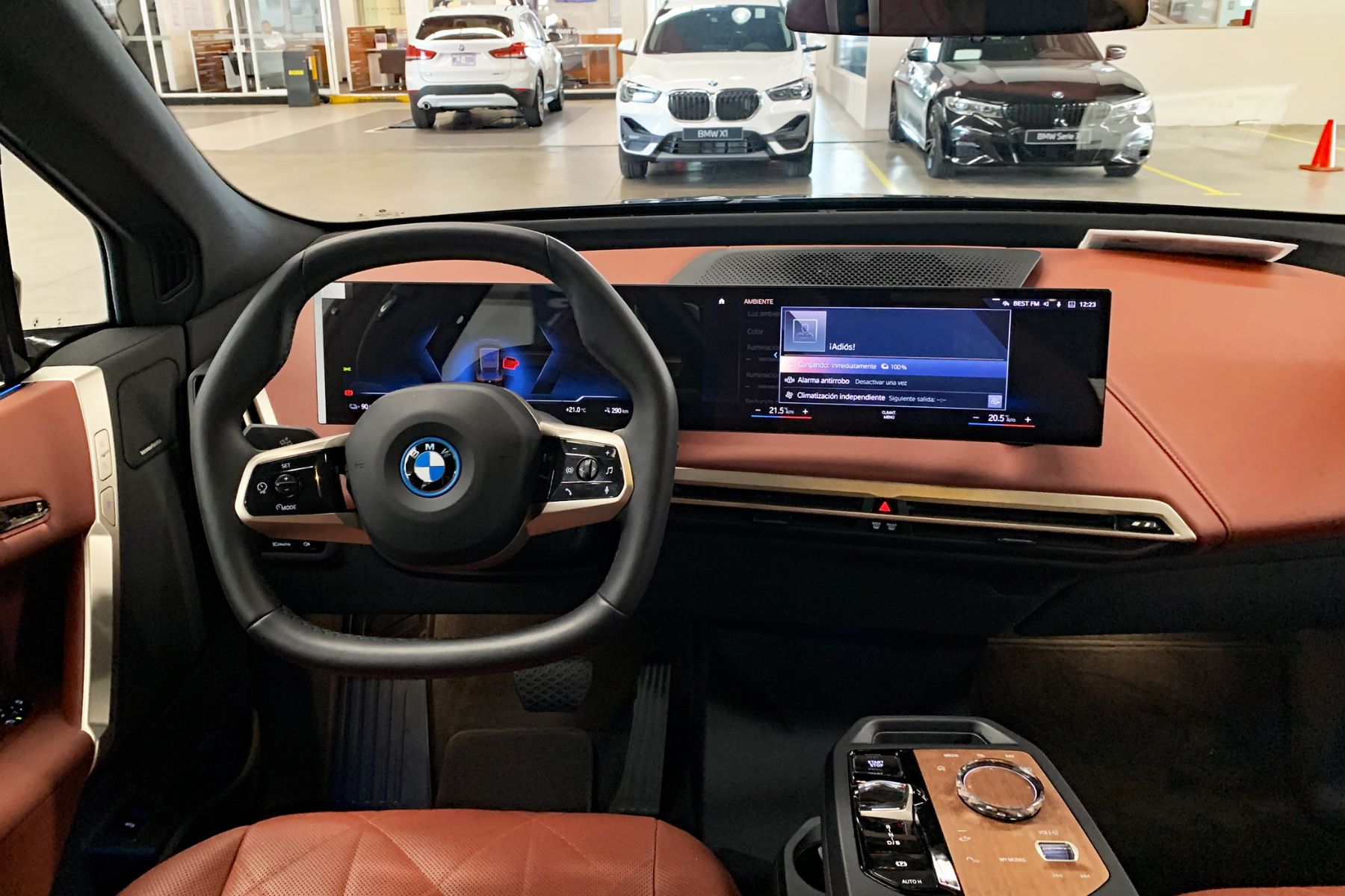
Inside the iX, BMW introduces a curved floating screen that feels more like high-end architecture than car tech. It’s a driver’s cockpit reimagined—free of clutter, packed with gesture control, and built with recycled materials that don’t sacrifice style. Sustainability plays a major role here, but the look still feels unmistakably premium.
Lexus LS (2021)
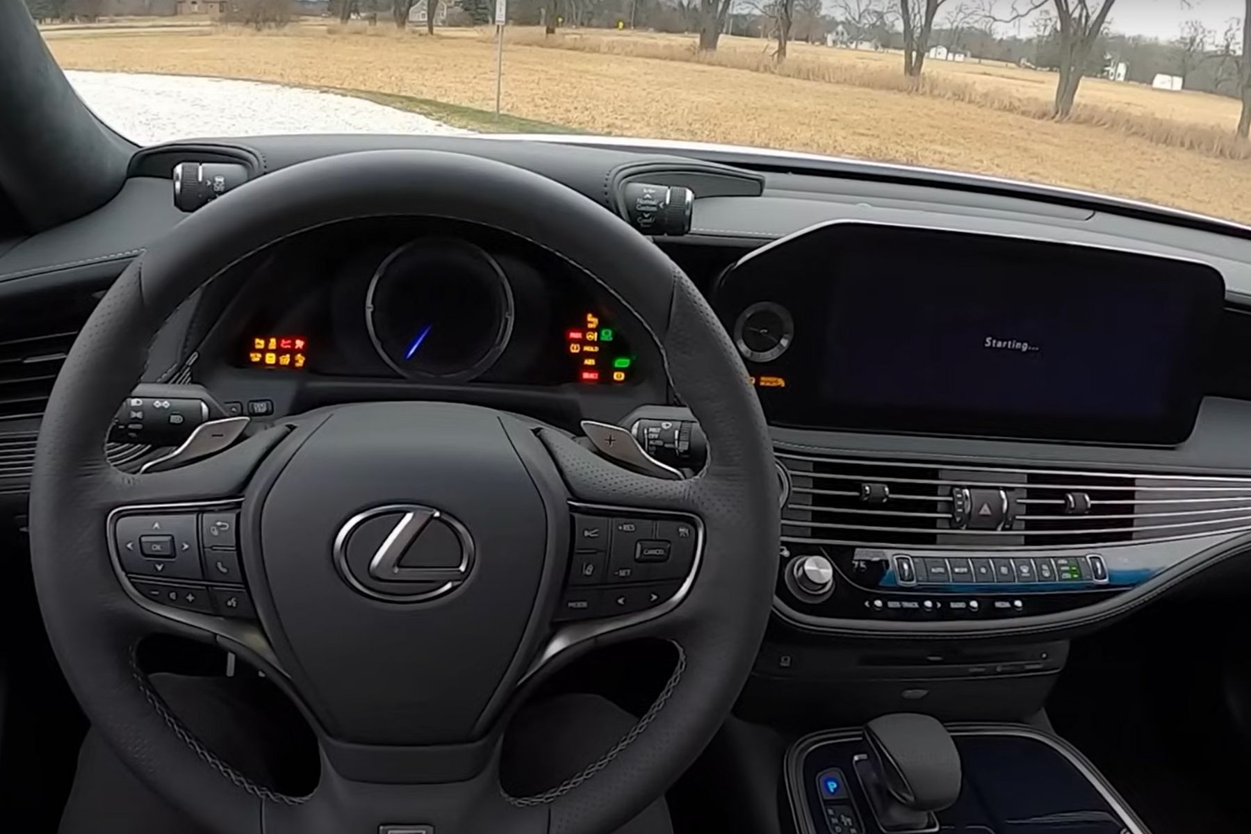
Step inside the Lexus LS and you’re met with a dashboard that feels more like a handcrafted gallery than a tech panel. Kiriko glass elements and Takumi-finished surfaces create a sense of artistry, not just design. The 12.3-inch split screen blends in seamlessly, and the ambient lighting mimics moonlight based on the time of day.
Volvo XC90
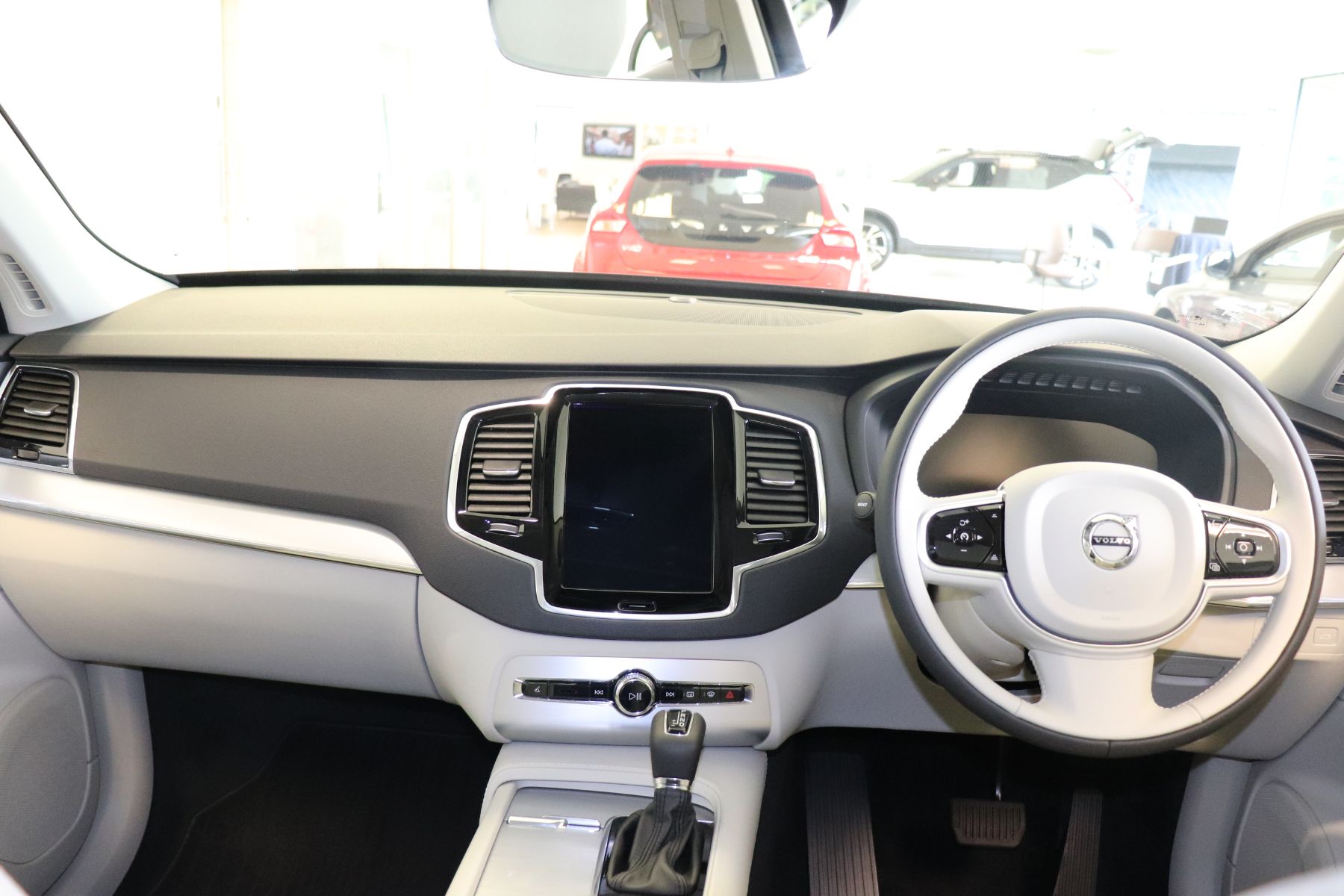
Clarity defines the XC90’s approach to dashboard design. Volvo’s tablet-style screen runs vertically, and its Scandinavian aesthetic strips away excess to keep drivers focused. You can even use it while wearing gloves. With Google Assistant built in and top-tier safety ratings, this dashboard proves that minimal doesn’t mean missing anything.
Porsche Taycan
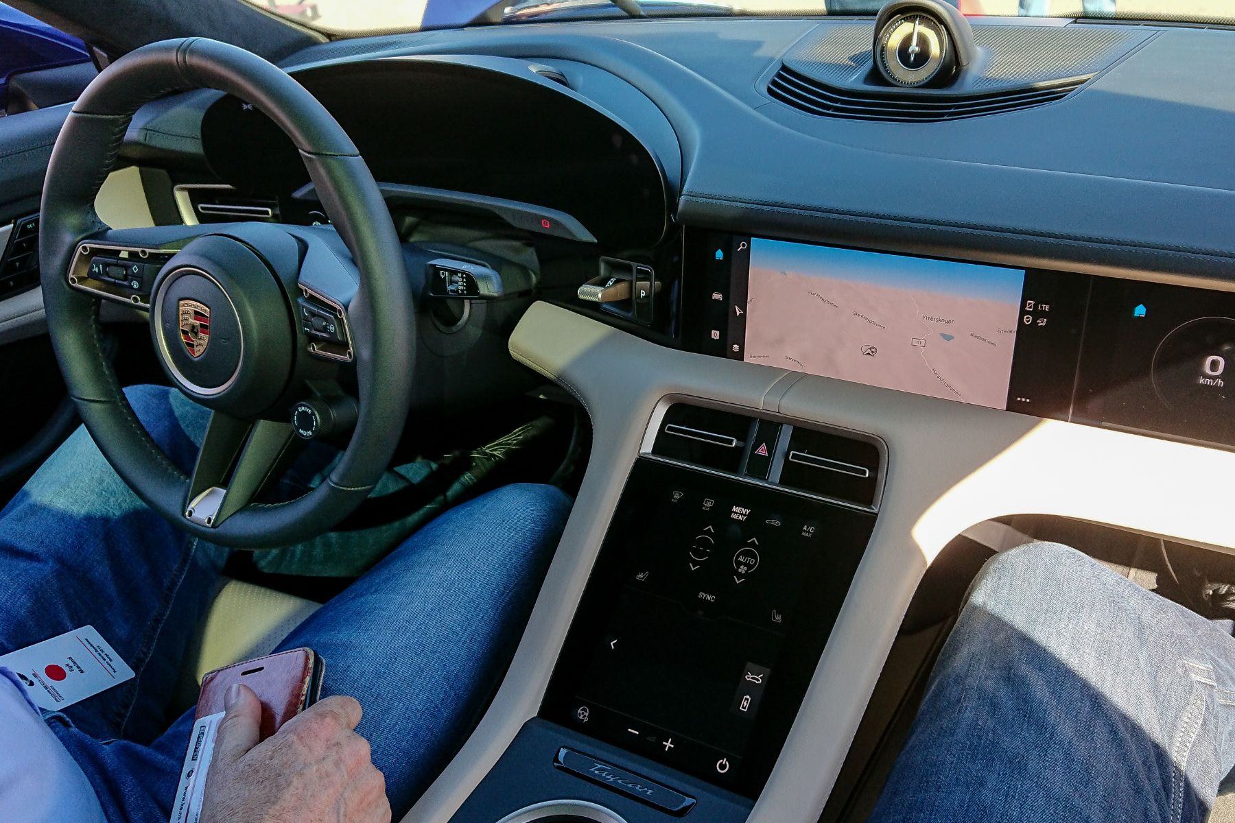
Technology doesn’t have to steal the joy of driving, and Porsche proves it with the Taycan. Four tailored screens, a passenger-side display, and a clean, button-free center panel bring innovation without sacrificing feel. The layout subtly nods to the iconic 911 and pushes fully into the electric age with a sleek, confident design.
Audi A8 (2021)
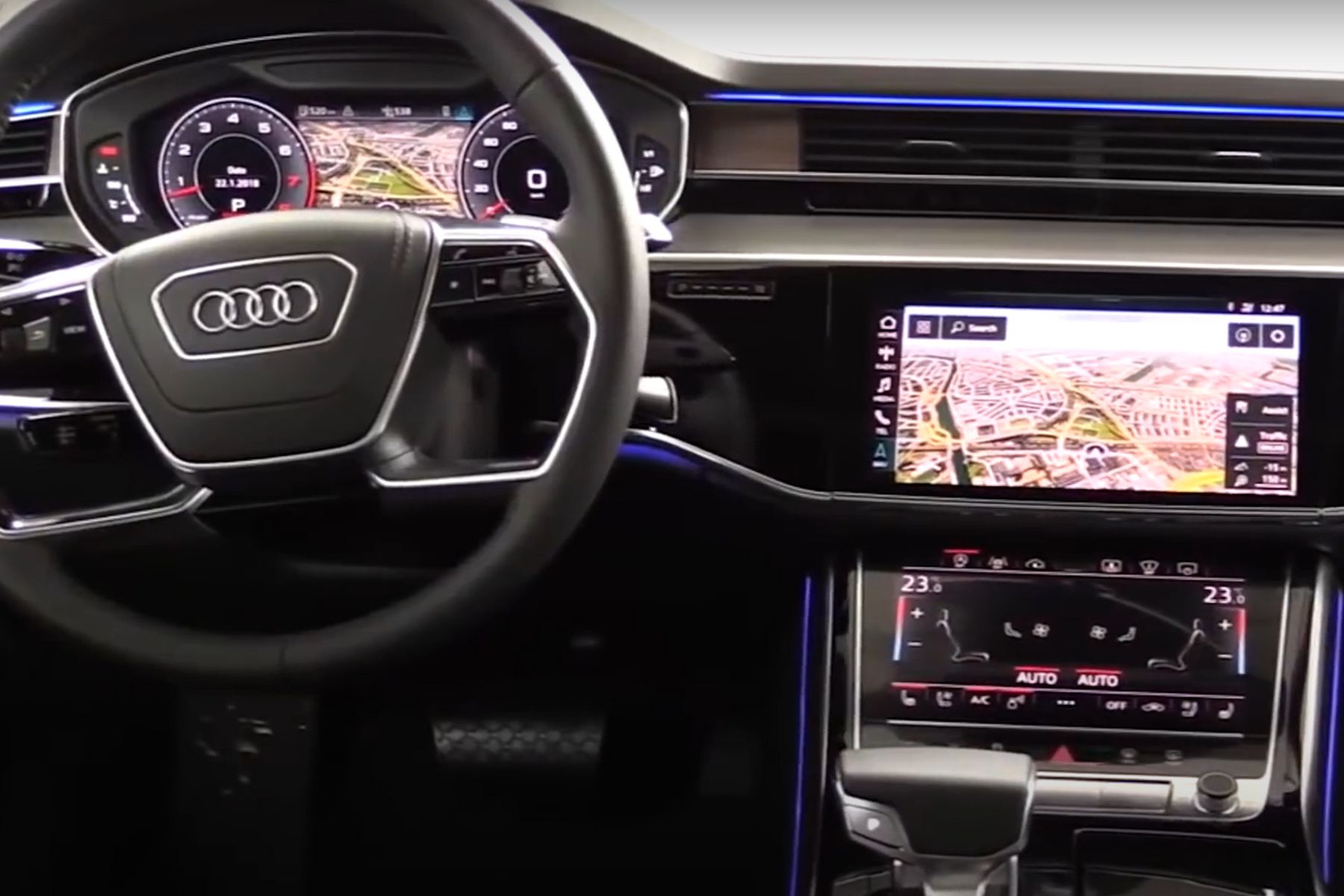
Touchscreens are nothing new, but Audi’s take feels different. The A8’s setup includes two sharp displays that have satisfying haptic feedback and mimic actual buttons. Wrapped in a polished, piano-black design, this minimalist layout feels both refined and deliberate. Voice controls work like a charm, and the overall system keeps distractions to a minimum.
Mercedes-Benz S-Class (2022)
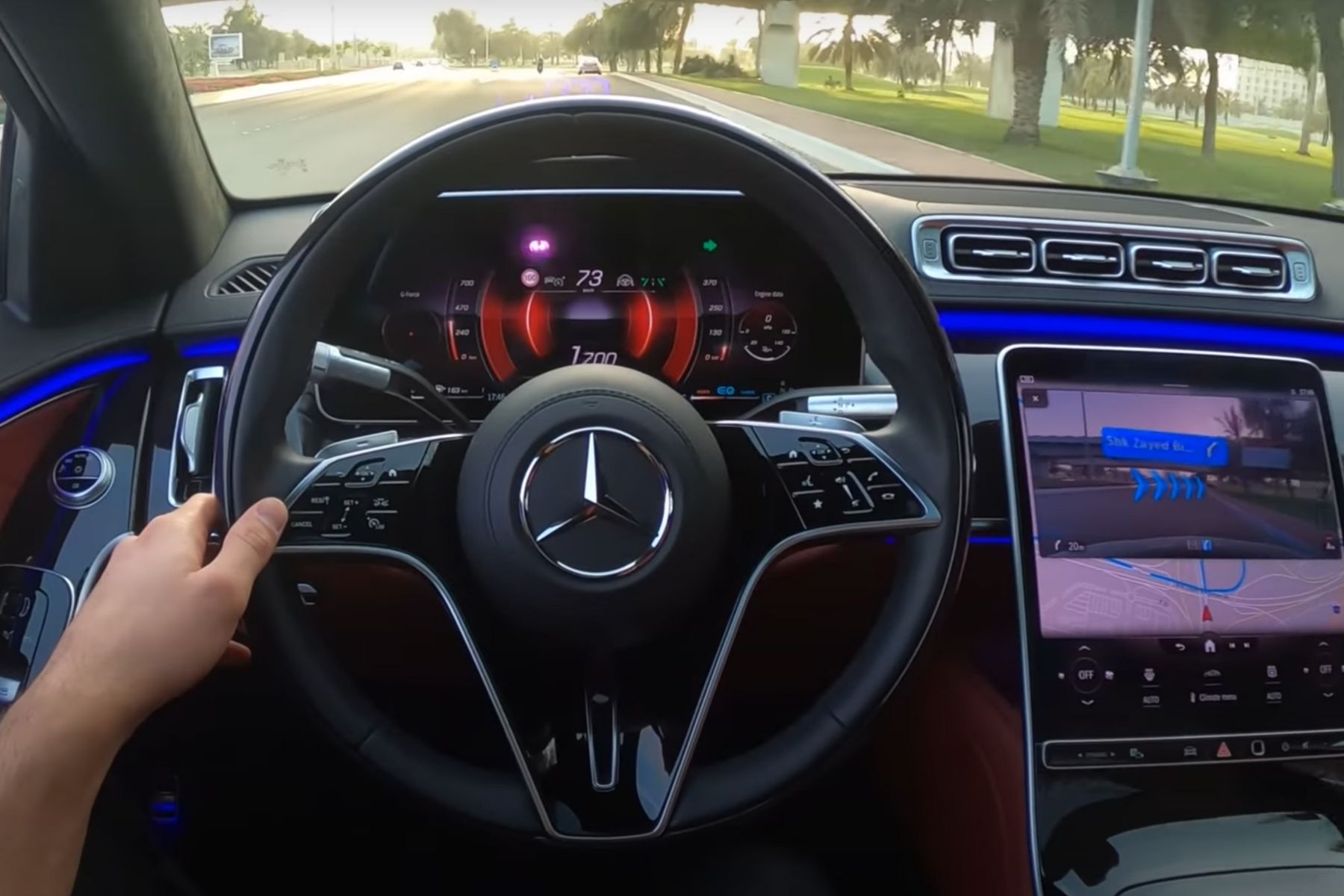
Benz didn't hold back in the S-Class. Its 12.8-inch OLED screen delivers crisp visuals while 3D gauges bring depth to every drive. The AR navigation even projects onto the windshield, and the car responds to your habits using the MBUX system. Fingerprint and face recognition tech add a level of luxury most dashes only dream of.
Now, let's shift from smart design to setups that missed the mark entirely.
Pontiac Aztek

Aztek’s dashboard layout sparked confusion from the moment it launched. A center-mounted instrument cluster broke driver focus, and the clunky design only made things worse. Reaching basic controls felt like a stretch—literally. Widely panned for poor ergonomics, it quickly became a poster child for early 2000s design misfires.
Fiat Multipla

Sitting in the Multipla was more like piloting a control panel than driving a car. Dozens of identical buttons covered the dash, none placed intuitively. The strange symmetrical layout added to the confusion. So, it left drivers second-guessing even basic functions. Critics also called it chaotic, cluttered, and a case of design completely disconnected from usability.
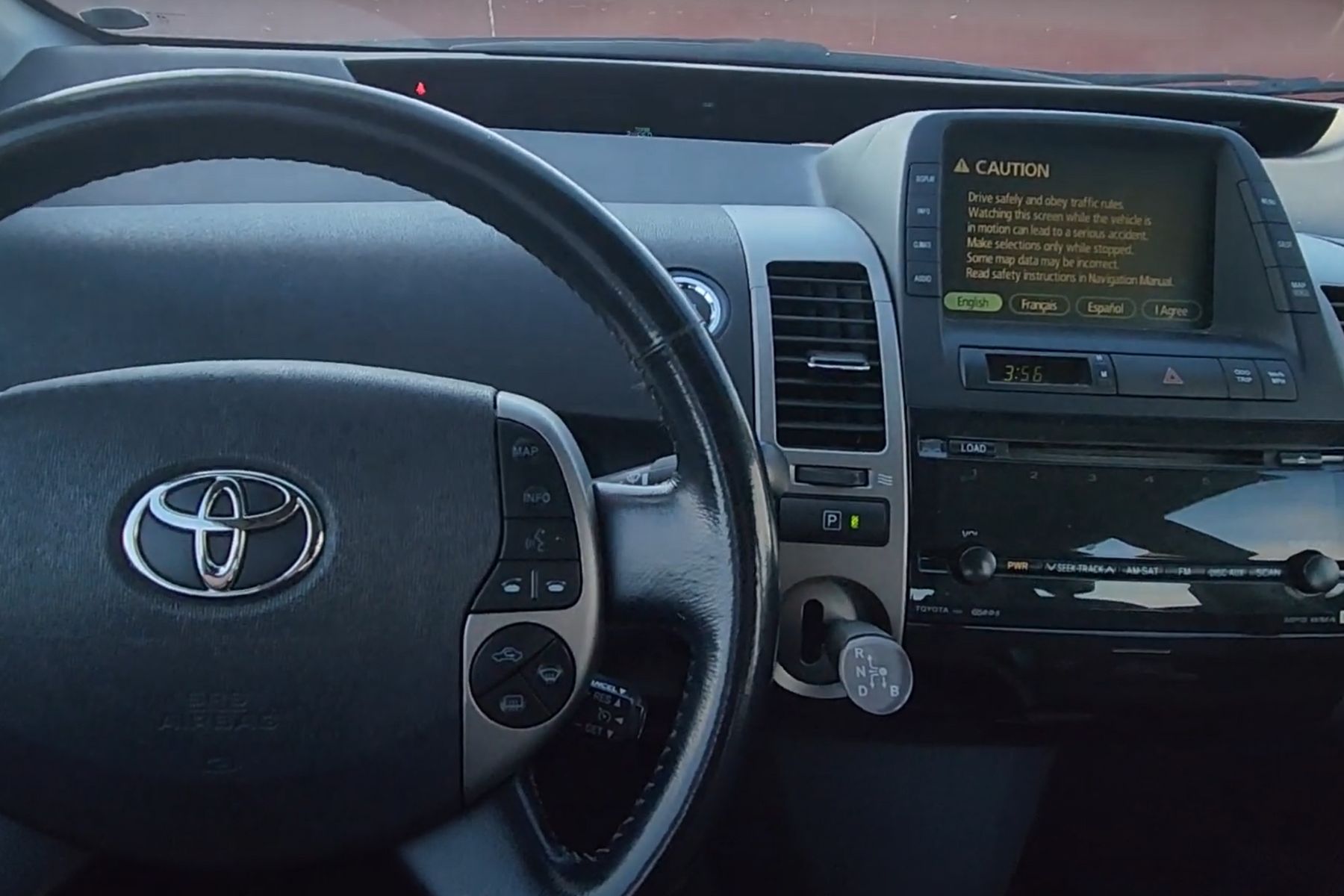
Toyota Prius (2004)
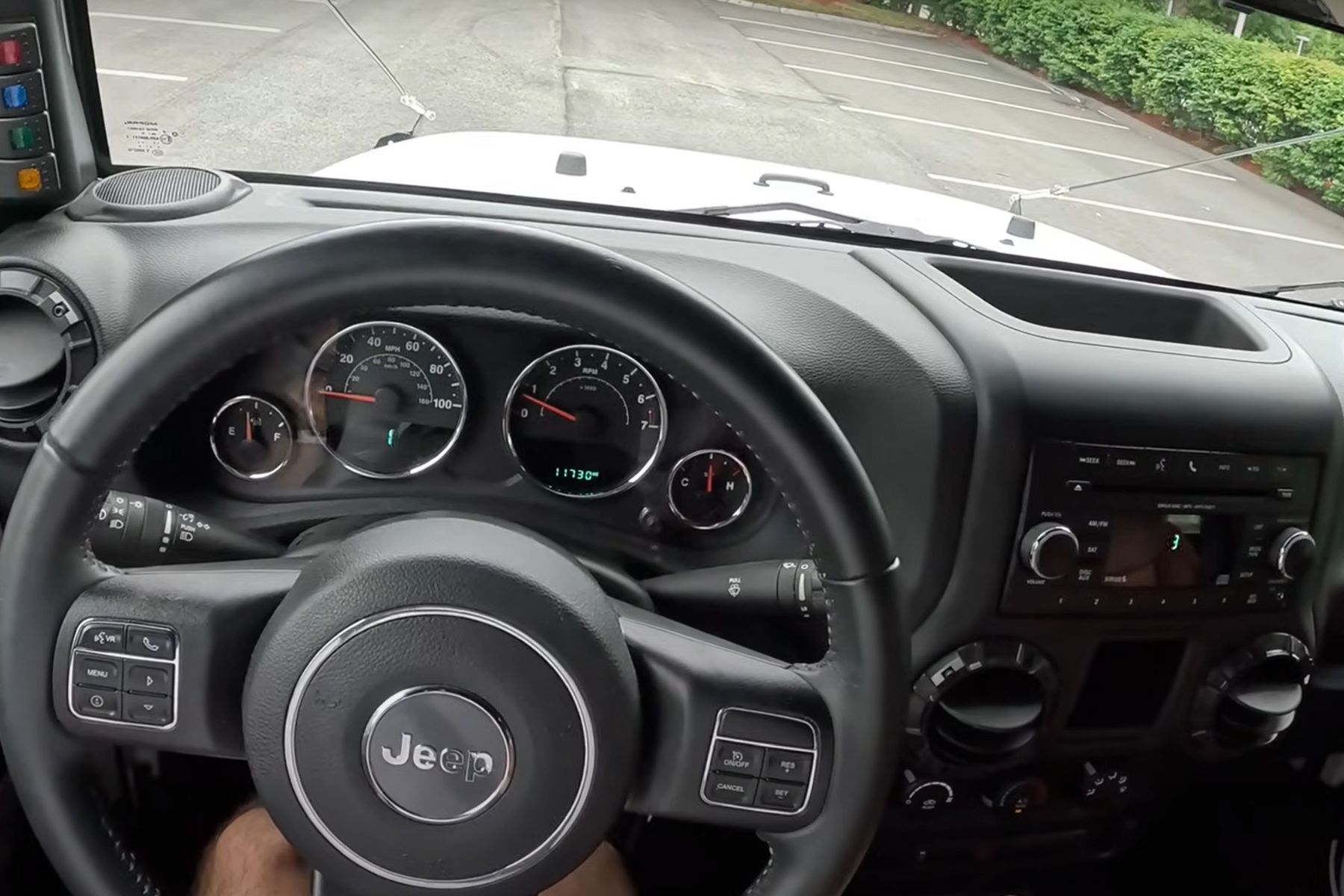
Jeep Wrangler (Pre-2018)
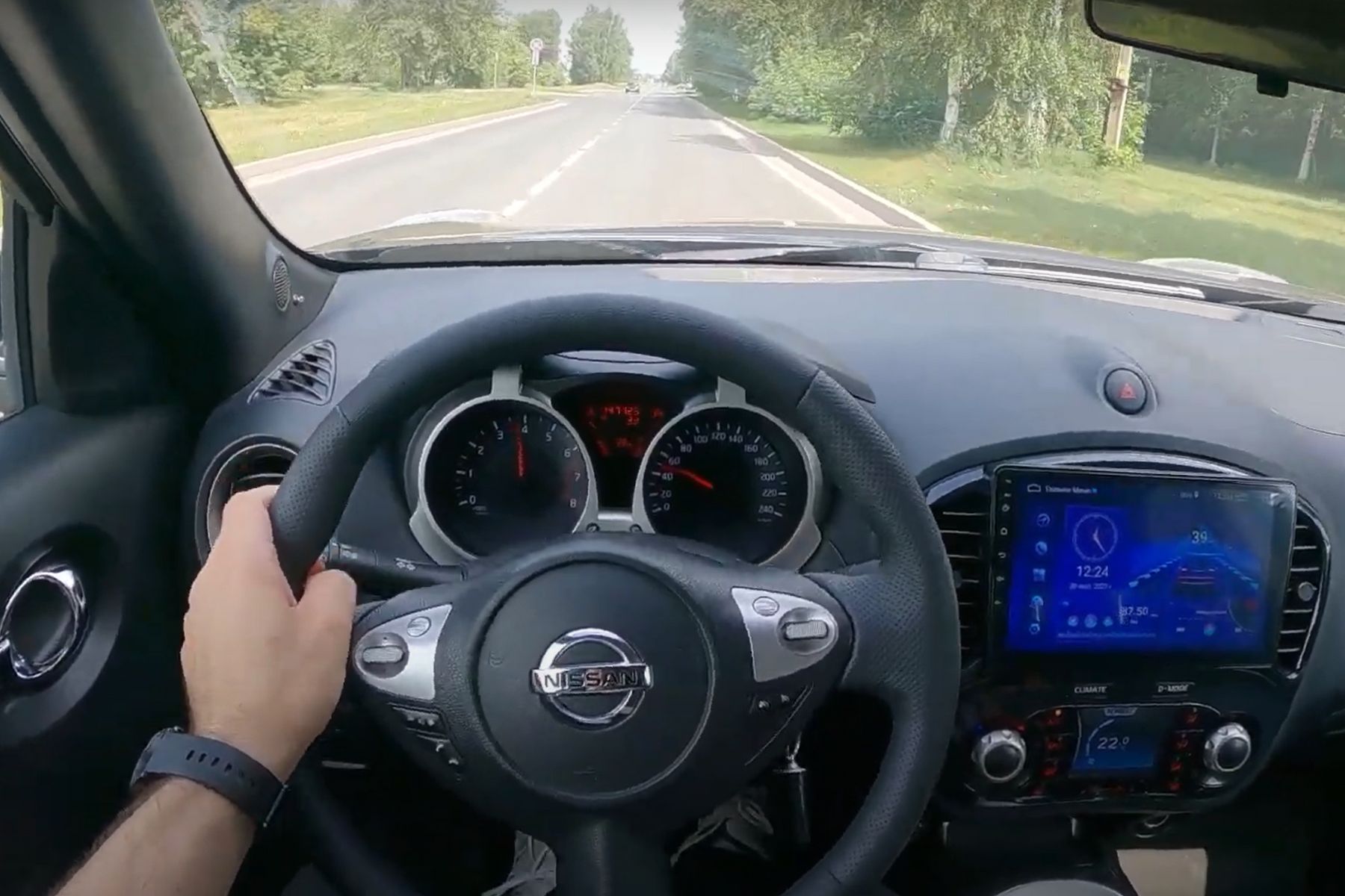
Nissan Juke (2011)
Mini Cooper (Pre-2014)
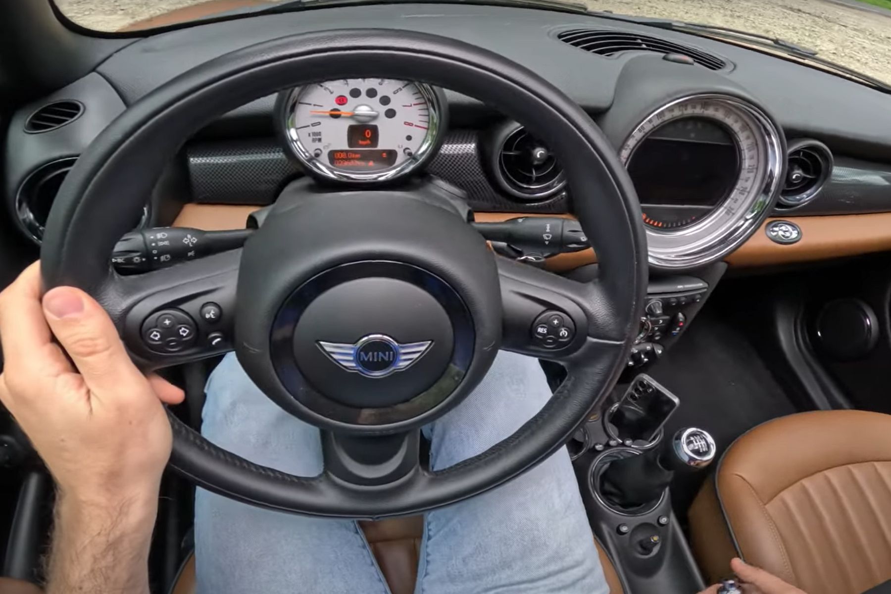
In the pre-2014 Mini, the oversized center speedometer turned heads, but it didn’t make driving easier. Important info was harder to track, especially with the tachometer buried behind the steering wheel. It looked different, sure, but drivers quickly grew frustrated. Eventually, Mini overhauled the design to better match its performance-driven reputation.
Chrysler Sebring (2007)
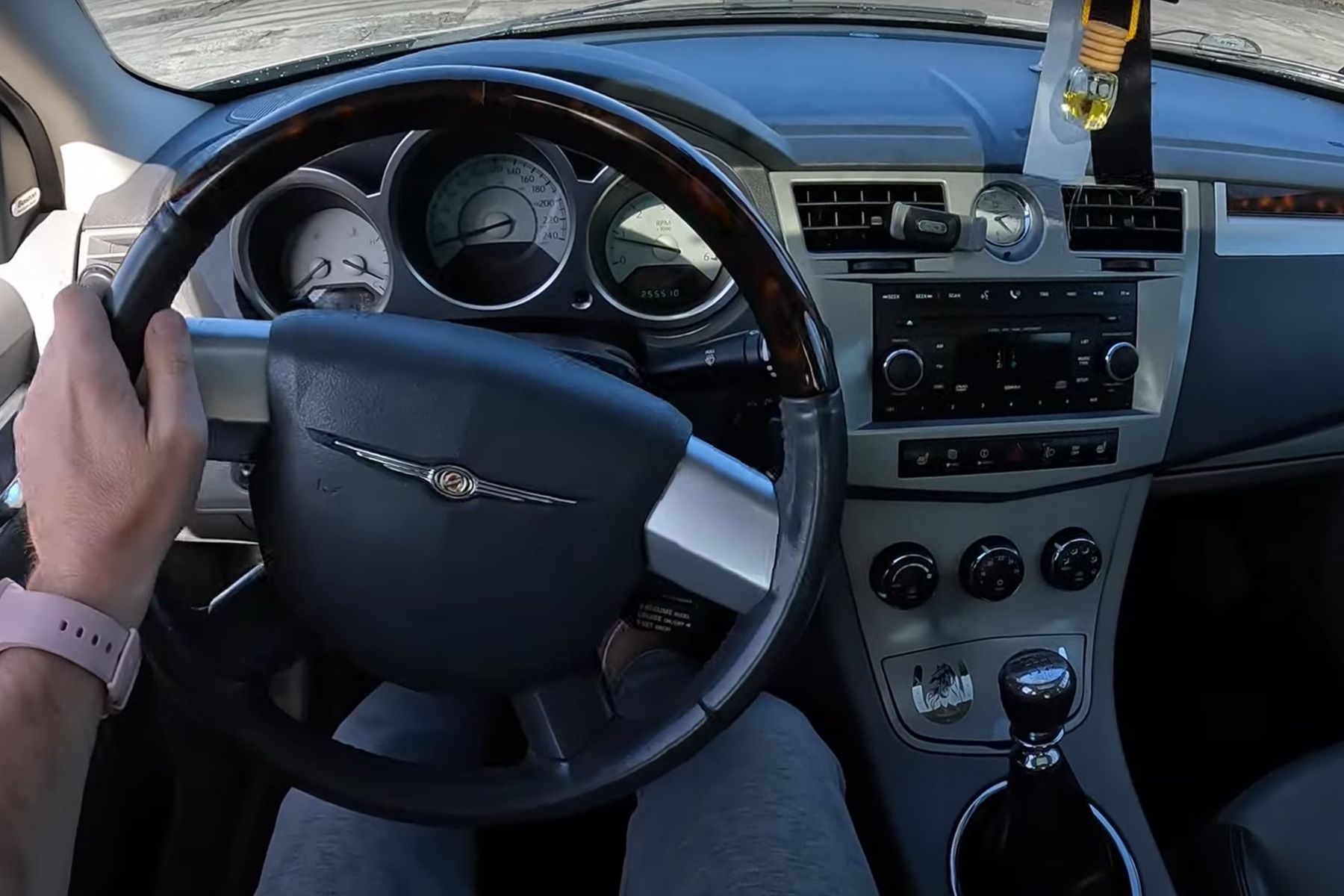
Nothing stands out inside the 2007 Sebring—not the layout, not the materials, not even the tech. The small, clustered screen offers little interaction, and the absence of modern conveniences makes the dashboard feel like an afterthought. So, it’s easy to see why reviewers called Sebring dull—the layout simply never gave them a reason to care.